I've been working on a small influence map to show the images that have been helping me out the most when making my thumbnails: I'm sure if you compare these pictures to my drawings you can see where a lot of them have come from! There's not really much in this presentation but I really wanted to compile some of Haeckel's art that I've found the most inspiring so far. Of course, I'm still using my previous inspiration maps throughout my thumbnails, but I'm now also using this one to give me a bit of an extra boost!
Monday, 30 October 2017
Sunday, 29 October 2017
The 'What If?' Metropolis - Digital Thumbnails 18-38
I think I've had some really successful ideas in this load of thumbnails! Before I talk about what went well, I wanted to quickly write about something I'd like to improve on as a reminder to myself and also to let others know what I'm thinking! The main problem I'm having at the moment is posting thumbnails regularly, but the problem is that it's hard to do that when you're not actually drawing thumbnails regularly. This is the main thing I want to focus on because it's really frustrating me! The OGR is on Wednesday and I really want to focus on that and getting some solid thumbnails in for it. I've not got any extra shifts at work and it's also reading week so I think I'll be able to get some good drawing time in. But as a general reminder to myself - draw more and even when you don't feel like it or you're busy, get at least a few ideas into your sketchbook!

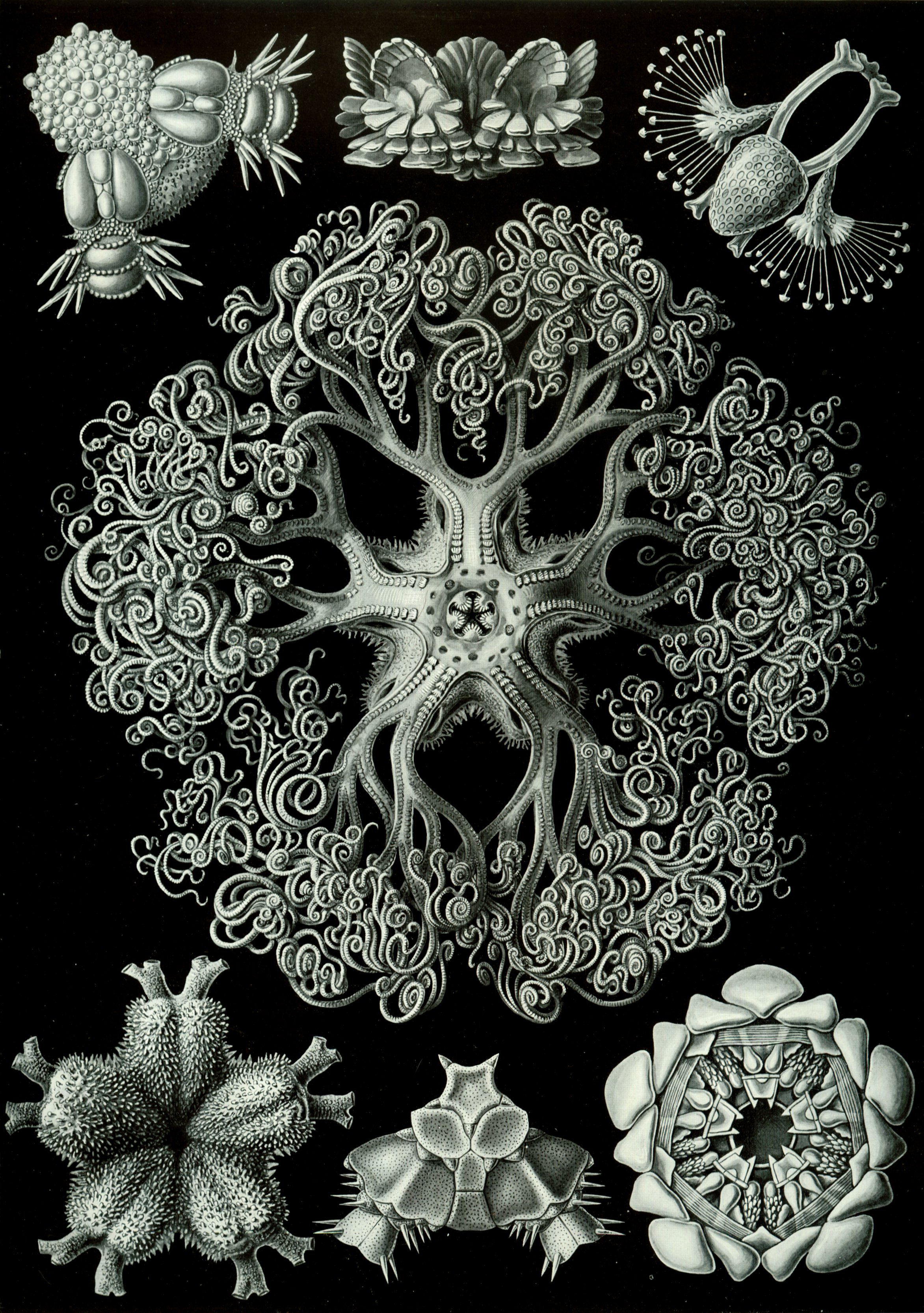
I really like thumbnails 19 and 20, and I think this could be quite a valid idea for a city. I originally started with number 18 and quite liked it and then began to develop in the next few thumbnails. However, I was only on a low number of drawings at that point so I didn't want to spend too long developing and not enough time looking at other interesting ideas! I found an interesting picture of Haeckel's work on Google (pictured below) and I really liked the drawing in the middle as it reminded me of a tree. I decided to pull from that inspiration and use it to make some kind of Haeckel-tree in thumbnails 24 and 25! I think this worked out really well. However, I remember Phil warning in the brief not to rely too heavily on the artist's designs that already 'look' like a building or other element of a city - I hope I've added my own spin on it to make it more Haeckel inspired instead of a direct copy of Haeckel's drawing.
I've pulled from a few more images in these next thumbnails and I've decided that I'll make another influence map including these ones. When I upload it, it'll probably be really clear to see what images relate to what thumbnails, so I'll be making it soon!

I like thumbnail 31 from this page, as I think it reflects the utopia/dystopia idea very well. The tall building in the middle is what I was considering as the utopian side - where all the elite live. Then the curling structures nearer to the ground are part of the dystopian part of the city - where the rejected live a less comfortable life, always reaching to get to utopia: the top dome.
Sorry for the big walls of text! I find it a lot easier to communicate my ideas when I write out my thought processes when making them. It also helps to organise my thoughts when I type it all out clearly. More thumbnails to come soon!
Friday, 27 October 2017
The 'What If?' Metropolis - Digital Thumbnails 1-17
I've had another go at scanning my thumbnails in and this time it went a lot better! I set my scanner at 600dpi instead of 300 and that made a big difference. Once I scanned my image, I took it into Photoshop and adjusted it how Phil advised so it's a bit bolder. I actually quite prefer this method to taking pictures - I can see how it's a lot neater and clearer. I've completed another page of thumbnails so I've scanned those in too, plus my first page now that it's looking better!


Thursday, 26 October 2017
The 'What If?' Metropolis - Digital Thumbnails 1-8
Following Phil's advice, I've scanned in my sketchbook and made my first set of thumbnails digital. However, I don't really like the outcome. It doesn't look right to me! I'm wondering whether its because the blue doesn't show up too well with my scanner. I'll have another go to try and improve the quality soon!


Wednesday, 25 October 2017
Contextual Studies - Realism
In our last contextual studies lesson we looked at realism, marxism, and propaganda. We talked about the different kinds of realism: visual realism; aural realism; realism of motion; narrative and character realism and social realism. We learnt about what each of these meant and also had a look at other thing that aren't realism - photo realism, magic realism, and hyper reality don't fit the definition of realism.
We also talked about the features realism include. What people consider to be realism isn't - soaps and kitchen sink dramas may be perceived as realism, but there's too much action for it to fit into that description. Realism would actually be quite boring, with a lack of drama to reflect how we would live our every day lives. We learnt a few more definitions in the lesson like:
Marxism - Meaningful to society, art should have a function
Semiotics - Language of symbols
Ideology - Expectations, a subtle form of propaganda.
For our next lesson we need to make a presentation about the essays we have chosen to write. More to come soon!
Life Drawing
I had such a great life drawing session today! I feel like I can really see the improvement in the first drawings I did compared to these ones today.


The 'What If?' Metropolis - Thumbnails 1-11
I've made a start on some thumbnails for my project! This is an aspect that I really struggled with during Invisible Cities, so I've made a few changes. I felt like I didn't have much breathing room with the thumbnails and they had to look 'perfect' - be these great ideas inside a little box, e.t.c. However after the first project I know this really isn't the way to work. I had so much trouble coming up with ideas because I was trying too hard! So this time I've going to do it my own way, not focusing on how it should look, and not care about how it's going to look because I'm trying to come up with ideas, not have a finished work of art from thumbnail 1. This time I'm not drawing boxes for my thumbnails (I'll focus on this later on when I have some more concrete ideas) and I'm drawing any idea that comes to me even if they are a bit rubbish! I really want to get to 100 thumbnails this time, so here's 1-11!


Life Drawing
Some life drawings from last week! I really wish I had a way to take better pictures of these.


Tuesday, 24 October 2017
The 'What If?' Metropolis - Ernst Haeckel
I'm going to start the ball rolling for the project with some research into the artist I've been given! I really like the look of Haeckel's work, and I love the idea of having an organically shaped city based on his art, as well as involving World War 1 influences to include relevant aspects of his life in the city.
Monday, 23 October 2017
Invisible Cities - Research
I completely forgot to upload this! Here is my research for Invisible Cities. As I'm more of a visual person, I decided to create small influence maps for each of the cities to enable me to explore them all.
Toolkit - Maya Texturing
Today we worked on creating textures in Maya. We made 7 spheres and used the hypershade to create different surfaces for each of them. We explored all of the basic materials like lambert, blinn and phong. Here are my spheres:

After this, we moved on to making different kinds of common materials. Here are some of the examples we completed in class. I really enjoyed doing this!


Silver

Chrome

Gold

Glass

Glow

Invisible Cities - Reflective Statement
I found the Invisible Cities project challenging but fun to do. I enjoyed picking a city and drawing out concepts for it. Although I struggled with making thumbnails, I think I've really improved my skills and for the next project it'll be a lot easier. Where I made thumbnails in very uniform boxes, I think it scared me a bit and gave me a lot of trouble when it came to trying to imagine up ideas. I realised, later on in the project when coming up with ideas for Zenobia, that if I didn't draw the boxes I felt a lot more free to come up with ideas, and it made it so much easier. It's amazing how such a tiny difference in my workflow has helped me enormously!
If there is one thing I could change about this project, it would be how I've managed my time. Going from a college course that didn't require any work at home and was only two days a week, to a full time uni course was a massive change for me and took some adjusting. At the beginning of the course, when we first got our brief, I wish I'd have gotten ahead with my work before the pressure really set in! Although I really regret leaving the work, I've definitely taken a lesson from this and will adjust how I work next time. This project was an eye-opener of what uni is like and it's definitely essential to put in more time compared to my old college course!
The main thing I enjoyed about the project was that I've never really done environments before, because I'm more of a character artist. I never had much confidence in doing environments as I've never actually practiced them, but once I got stuck in I realised it wasn't going to be as bad as I thought - it was actually very fun to do, in fact. This was the main thing that surprised me about the project, as I came in a bit apprehensive about how well I was going to do. I quite like my finished designs, and although they could do with a bit more detail, they are a good start to my first year. This is a good starting point for me to improve!
In conclusion I've really enjoyed the first project of uni. I'm excited to move onto the next one so I can take what I've learnt forwards with me.
Sunday, 22 October 2017
Toolkit - Maya Alleyway
I have completed the first video for the alley. Here is the lamp post, start of the crate and alley environment.


Film Review - Alien
Alien, a sci-fi horror film of your nightmares, was made in 1979 by Ridey Scott. It focuses on a cargo spaceship and its crew. When it intercepts a signal from another planet, it discovers a horrifying alien which massacres the crew, slowly killing them one by one. Although the story is simple, it is filmed in such a way that keeps the audience in the edge of their seats.
 |
| Fig. 1 |
Scott is talented at creating suspense in the film. "One of the great strengths of Alien is its pacing. It takes its time. It waits." (Ebert, 2003), and this makes it one of the most gripping movies of all time. Scott knows how to build up tension, using music, camera shots, and most of all, time. He doesn't immediately skip to the action: that would be useless. Instead, he builds up the story slowly, gives the viewer a false sense of security, and then suckers them right in the face with a mutated octopus. Scott makes it feel like you're in the film instead of just watching it: using techniques like shaky camera scenes, dark lighting as the film progresses, and even how the actors talk - sometimes you can't even hear what they're saying. This is all trying to replicate real life, and Scott succeeds in doing this amazingly well.
 |
| Fig. 2 |
Not only is Alien progressive in a film sense, it is socially too. "Some women may be impressed by that actress Sigourney Weaver emerges as the 'hero' of the ordeal and the fact that the computer — even though dispassionate and calculating — is dubbed Mother and has a female voice." (Leogrande, 1979). Weaver is a strong main character and isn't shown as a damsel in distress - she's surviving on her own, and, in the end, she succeeds. She is an intelligent woman and uses her head in time of distress, and that ultimately saved her life. The same can't be said for the rest of the crew - but it wouldn't be a horror movie without a few deaths. It's amazing to see how movies have progressed in this way over the years. The original King Kong, made in 1933, makes incredibly uncomfortable viewing because of the blatant sexism and racism throughout. By contrast, Alien, which was only made a little over 30 years later, has a strong female lead and black characters without any stigma around them at all.
 |
| Fig. 3 |
The progression throughout the movie, starting off in a comfortable spaceship made to humans, and then transitioning to the dark, leaking metal vessel which is more of a home to the alien than the humans. The change in set design through the film is something that's "difficult to beat" (Malcolm, 2009), and a lot of thought has obviously been put into it. Alien constantly keeps the audience on their toes, with the alien constantly changing forms, as well as the set and lighting. The music creates suspense at the right times, and definitely adds to the movie instead of just being something to 'accompany' it, like in some many other films. Overall, Alien is a well thought out and progressive film that builds up tension, leads in to action, and has a satisfying ending of one survivor (and a cat).
 |
| Fig. 4 |
Bibliography
Ebert, R (2003)."Alien". In rogerebert.com [online]. Available at: (http://www.rogerebert.com/reviews/great-movie-alien-1979)
Leogrande, E (1979). "Alien’ tears its way into our nightmares: 1979 review". In nydailynews.com [online]. Available at: (http://www.nydailynews.com/entertainment/movies/alien-tears-nightmares-1979-review-article-1.2648407)
Malcolm, D (2009). "Derek Malcolm's Alien review from 1979" In The Guardian [online]. Available at: (https://www.theguardian.com/film/2009/oct/13/derek-malcolm-alien-review)
Illustration List
Fig. 1 - https://filmdb.showcasecinemas.co.uk/FilmImages/45/1/49192/alien%20one%20sheet%20poster.jpg
Fig. 2 - https://static1.squarespace.com/static/5637f9fbe4b0baa6d85a1011/56382b71e4b0dcf08214a809/577dcd5d20099e0c9bfdda81/1467937667508/alien-1979-por-trás-das-cenas.jpeg?format=1500w
Fig. 3 - https://i.ytimg.com/vi/x1yRMxS7TT8/maxresdefault.jpg
Fig. 4 - https://33hpwq10j9luq8gl43e62q4e-wpengine.netdna-ssl.com/wp-content/uploads/2017/05/alien-1979-2.jpg
Who's Who? - Oscar Gregeborn
I hope this is a suitable concept artist presentation. I couldn't actually find much about Oscar Gregeborn online, which isn't much of a surprise as he's still very young. I found his art so inspiring I had to research him: even if there wasn't much information to go on!
Invisible Cities - Process GIFs
Here are the three process GIFs for my Invisible Cities project.


Exterior Establishing Shot

Exterior Low Angle Shot

Interior Shot

Thursday, 19 October 2017
Sunday, 15 October 2017
Invisible Cities - Zenobia Colour Keys
In Jordan's most recent class he set us the task of making main colour keys from our favourite thumbnail. I decided to work on a digital version of a design I came up during the lesson, which is this one:

I really like this design, and I wanted to try out doing it digitally and applying different colours, so this was the perfect opportunity. I was a bit apprehensive when I started in Photoshop, because although I love colour, I'm not very good at applying it myself. First, I started out by colouring the grass green, huts brown, e.t.c, but I realised that wasn't the right way to go about it. Instead, I decided to make everything greyscale to help me a bit. I really enjoyed it after that, and the picture progressed quickly. I was really amazed at how much simpler it was to understand light and shadow when just using greys, and when I finished I felt a lot more confident in my abilities. Here is my finished greyscale image.

It's still a little empty, it needs more platforms, houses, and I'd like to include some tall trees (with vines possibly) too. Now I'm working on just one city instead of trying to come up with ideas for all of them, I've had a lot more time to think about what I want Zenobia to look like. The main ideas I have floating about in my head at the moment is how the inhabitants will get around: my favourite thoughts have been that they use big kites to fly with, or slides! I also want to include a kind of food source in the city - how are they getting their food when up above the ground? I still have a lot to think about! Anyway, enough rambling, here's the colour keys I've developed from my greyscale image.

I think I learnt a lot more from colouring the greyscale Zenobia than from doing the new ones. Nevertheless, the colour keys aren't bad, even if they are a little plain. I want to work with more natural colours so I want to start focusing on browns and greens, with maybe some contrasting colours to make the city pop out a bit more. I'm still a bit new to gradient maps and colour keys so these ones aren't great, but at least they're a start. My next stage is to come up with some more solid designs and then continue to develop colour along with it. The deadline is looming and I feel like I still have so much to do! 😨
Toolkit - Maya Scooter
Finally finished the scooter we were asked to model using the Maya tutorials!

Friday, 13 October 2017
Toolkit - Monster Orthographic Views
Today in Simon's class we carried on with our monster designs, taking the one we did in Illustrator into Photoshop. We were shown how to do the orthographic views for a character, and I had fun making mine in different views. Unfortunately, because my Beatnik monster wasn't too detailed, the orthographic views don't vary too much. Here is the finished product:


And also a Beatnik bunny because I finished a little early!

Toolkit - Follow Through and Overlapping Action
In Nat's lesson today we worked on some more principles of animation: follow through and overlapping action. During the class we had to build on the ball we made last lesson to give it a tail/limbs, and then make those extra features move along naturally with the ball. Nat suggested doing a rabbit ball with ears that flop, or a cat with a tail. I decided to do a rabbit and wanted to make it a bit more detailed than a ball so I started with a new Flash document and sketched out a basic cartoon bunny. Here is my rough animation, where the bunny hops up and down and follows the arcs I've drawn in:

As you can see, the ears move more independently from the body, which is called overlapping action. When the rabbit stops and the ears keep moving, that's called follow through. It's generally used for things like hair and clothes on people, as after they stop moving, the hair/clothes naturally keep on going even though the person wearing them has stopped. After finishing my rough GIF, I used the rest of the lesson to neaten it up. I started with a 1920x1080 canvas but I realised I wasn't using a lot of the space, so I made it a bit smaller. Here's my finished product:

I really enjoyed this lesson, especially because it had rabbits in it! I liked recapping follow through and overlapping action, since the last time I went over the principles of animation was about a year ago! It was also nice to do a more detailed animation, building on from the skills we learnt with the bouncing balls.
Thursday, 12 October 2017
Invisible Cities - Zenobia Influence Maps
Here are the interior and exterior influence maps for Zenobia. I want to go with Chinese and Japanese architecture, but I've also pulled a few influences from Thai and Korean architecture too. For the interior of the houses I want it to look quite cluttered and home-like, and this wasn't really present in Japanese interior design, so I was glad to look at a few different influences to get the kind of feel I was looking for.
Film Review - 2001: A Space Odyssey
2001: A Space Odyssey (1968), by Stanley Kubrik, is a bold and unusual film that uses incredibly realistic acting and effects from before the time of CGI. The story follows a mysterious monolith through space and time, as well as focusing on modern artificial intelligence going rogue - something humans have always feared.
Often described as an "unconventional plot" (Fox, 2011), the film may, at first, be a bit confusing for some when it opens up in the pre-human era, where ape-like creatures discover the monolith for the first time. The apes gradually evolve, discovering new tools and methods of survival. Although this beginning is wildly different from the rest of the film visually, (mainly because it's set on Earth instead of space) the picture is absolutely stunning, as are the scenes to come.
 |
| Fig. 1 |
Directly following the ape scene, the viewer is launched into the future where the monolith has been found in a crater on the moon. The story then continues to fast-forward to 18 months in the future, where a mission has been launched to Jupiter, the planet where the monolith's strange signals are heading towards. However, on this mission the artificial intelligence computer that controls the ship, known as HAL 9000, malfunctions and become creepily human-like, as well as cruel and violent. After HAL murdering four of the crew members on the ship, it is up to the remaining member, Dave, to shut off the AI for good. Dave succeeds in this and continues his mission to Jupiter where he finds an even bigger monolith. From there we are launched into an incredible light show which ends with Dave in a hotel room, quickly ageing in an eerie way, before becoming immortal in space.
The film isn't fast-paced: in fact, it's exactly the opposite. Kubrick takes his time to make beautiful scenes, which makes the movie feel like a work of art rather than a film. Although the story is, at times, hard to understand, Kubrick more than makes up for it with the stunning visuals. The story in 2001 is Kubrick's own; he doesn't embellish it or make it more 'mainstream' to please other people, and that is probably a big contribution to the success of the film. It isn't made to conform to other people's standards, it's made to stand out and be different.
 |
| Fig. 2 |
Kubrick has been more than meticulous about the film's appearance. He often uses symmetry and one-point perspective to make his shots look amazingly balanced. Not only this, but the use of music in the film really adds to it, using a range of classical pieces to describe different atmospheres. The music also makes up for the lack of speech as "the first spoken word is almost a half hour into the film, and there's less than 40 minutes of dialogue in the entire film" (Dirks, no date). Although the characters don't say much in the film, it's still obvious what they're doing and why, and this is all described through set design, acting, costume and music. It's amazing how Kubrick has managed to make a scene 'talk' without actually having any character physically speaking.
 |
| Fig. 3 |
At the end of the film, it is a lot more confusing, especially during the psychedelic scene that lasts for just under 10 minutes, followed by the slightly puzzling scene in the hotel/bedroom. "The film did not provide the clear narrative and easy entertainment cues the audience expected. The closing sequences, with the astronaut inexplicably finding himself in a bedroom somewhere beyond Jupiter, were baffling." (Ebert, 1997). Even though it can be difficult to understand, one of the main points is that it really makes you think about the story, what it means, and why the film was made in this way. 2001 really pulls attention to itself not only by its amazing visuals, but also by its unconventional and original story, which is something that not many films can do.
 |
| Fig. 4 |
Bibliography
Fox, K (2011). "My favourite film: 2001: A Space Odyssey". In The Guardian [online]. Available at: (https://www.theguardian.com/film/filmblog/2011/dec/12/favourite-film-2001-space-odyssey)
Dirks, T (no date). "2001: A Space Odyssey (1968)". In Filmsite [online]. Available at: (http://www.filmsite.org/twot.html)
Ebert, R (1997). "2001: A Space Odyssey". In Roger Ebert [online]. Available at: (http://www.rogerebert.com/reviews/great-movie-2001-a-space-odyssey-1968)
Illustration List
Fig. 1 - https://cdn-images-1.medium.com/max/2000/1*v3Fxrk0rzkuyD_R0VyhBVA.jpeg
Fig. 2 - https://nonamemovieblog.files.wordpress.com/2012/04/2001-dead-room.jpg
Fig. 3 - https://i.pinimg.com/originals/68/e5/d7/68e5d7737321931f486530ee5832d2c3.jpg
Fig. 4 - https://cmsplatypus.gothamist.com/gothamistgallery/2017/3/21/f3c592375img_0018-13-jpg.jpeg
Film Review - King Kong
King Kong, directed by Merian Cooper in 1933, is definitely an interesting watch. The behaviour of society at the time is captured in this film very well; the sexism and racism is very prominent. The general plot of the film is one that most people are probably familiar with: Anne, the main protagonist has captured the eye of the giant ape King Kong, who is then captured and taken to New York City where he wreaks havoc until killed. What is more interesting than the plot, however, is the way the characters act, and more importantly, why.
 |
| Fig. 1 |
As stated in many reviews, "modern viewers will shift uneasily in their seats during the stereotyping of the islanders in a scene where a bride is to be sacrificed to Kong" (Ebert, 2002). Not only this, the stereotypy of Anne as a screaming damsel in distress is also something that is quite unsettling to a modern audience. It is interesting to see how stereotypes have changed, and also slightly horrifying to see how to world used to be stuck in rigid views of how specific genders or races should act.
Despite the blatant sexism and racism in the film, it was still a ground breaking picture of its time, and has now spawned many sequels and remakes. Described as "ahead of its time" (Haflidason, 2001), the special effects were something that not many people had seen before. In 1933 the film industry was still developing, and technology was moving slowly forwards. Although we may find it silly now, it was a film that was so life-like back then that it had people on the edge of their seats.
 |
| Fig. 2 |
 |
| Fig. 3 |
Bibliography
Ebert, R. (2001). "King Kong". In: RogerEbert [online] Available at: (http://www.rogerebert.com/reviews/great-movie-king-kong-1933)
Haflidason, A. (2002). "King Kong (1933)". In BBC Movies [online] Available at: (http://www.bbc.co.uk/films/2001/01/30/king_kong_1933_review.shtml)
Dirks, T (no date). "King Kong (1933)". In filmsite [online] Available at: (http://www.filmsite.org/kingk3.html)
Illustration List
Fig. 1 - http://www.attitudedesign.co.uk/sites/default/files/wp-content/uploads/2011/11/KingKongPoster.jpg
Fig. 2 - https://thenypost.files.wordpress.com/2017/03/kong1933a.jpg?quality=90&strip=all&strip=all
Fig. 3 - https://ianfarrington.files.wordpress.com/2016/07/kk1933.jpg
Life Drawing
Some of my favourite life drawings from yesterday. Definitely need to work on taking better pictures of these!


Subscribe to:
Posts (Atom)