I think I've had some really successful ideas in this load of thumbnails! Before I talk about what went well, I wanted to quickly write about something I'd like to improve on as a reminder to myself and also to let others know what I'm thinking! The main problem I'm having at the moment is posting thumbnails regularly, but the problem is that it's hard to do that when you're not actually drawing thumbnails regularly. This is the main thing I want to focus on because it's really frustrating me! The OGR is on Wednesday and I really want to focus on that and getting some solid thumbnails in for it. I've not got any extra shifts at work and it's also reading week so I think I'll be able to get some good drawing time in. But as a general reminder to myself - draw more and even when you don't feel like it or you're busy, get at least a few ideas into your sketchbook!

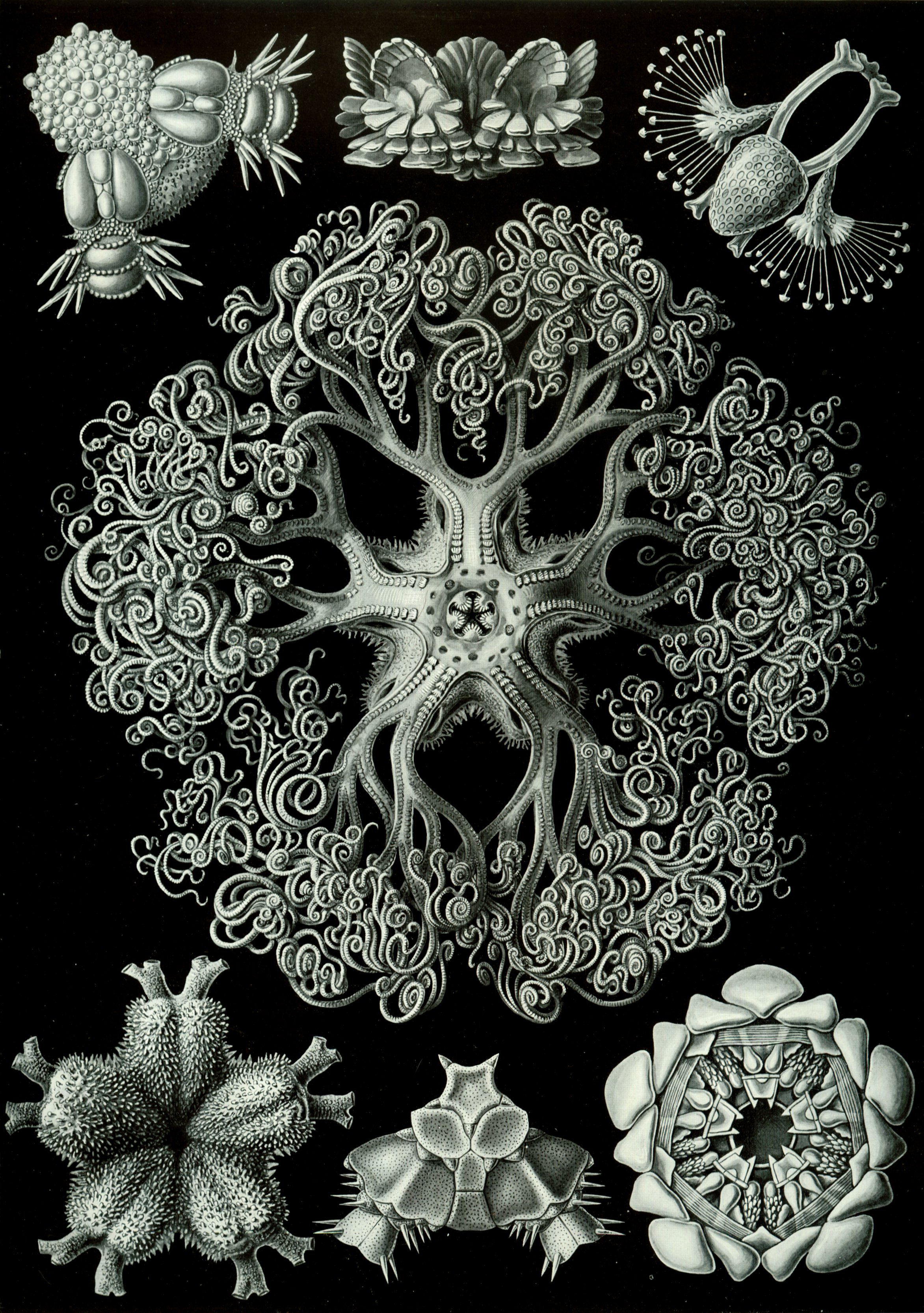
I really like thumbnails 19 and 20, and I think this could be quite a valid idea for a city. I originally started with number 18 and quite liked it and then began to develop in the next few thumbnails. However, I was only on a low number of drawings at that point so I didn't want to spend too long developing and not enough time looking at other interesting ideas! I found an interesting picture of Haeckel's work on Google (pictured below) and I really liked the drawing in the middle as it reminded me of a tree. I decided to pull from that inspiration and use it to make some kind of Haeckel-tree in thumbnails 24 and 25! I think this worked out really well. However, I remember Phil warning in the brief not to rely too heavily on the artist's designs that already 'look' like a building or other element of a city - I hope I've added my own spin on it to make it more Haeckel inspired instead of a direct copy of Haeckel's drawing.
I've pulled from a few more images in these next thumbnails and I've decided that I'll make another influence map including these ones. When I upload it, it'll probably be really clear to see what images relate to what thumbnails, so I'll be making it soon!

I like thumbnail 31 from this page, as I think it reflects the utopia/dystopia idea very well. The tall building in the middle is what I was considering as the utopian side - where all the elite live. Then the curling structures nearer to the ground are part of the dystopian part of the city - where the rejected live a less comfortable life, always reaching to get to utopia: the top dome.
Sorry for the big walls of text! I find it a lot easier to communicate my ideas when I write out my thought processes when making them. It also helps to organise my thoughts when I type it all out clearly. More thumbnails to come soon!
This is a great post, Chloe - insightful and authentic - and yes, I like those spatial thumbnails 18,19, 20 too - feeling the architecture and the sense of scale beginning there :) And your advice re. 'just doing it' whether you've got the time or not is great advice - nobody on an arts degree should be 'waiting for the perfect moment in which to be creative or think creatively' - trust me, that perfect mythical moment never comes, because there's always something in the way or something else to do or whatever - just get the work out as and when! :)
ReplyDeleteThanks!! I aim to post some more thumbnails tonight or in the morning to try and keep up the momentum! :)
Delete