Thursday 30 November 2017

The 'What If?' Metropolis - Concept Art Progress

Still nowhere near where I want it to be yet... But it's getting there! One thing I didn't anticipate was that it would be such a drag to redo work you've lost. Because you've already done it you don't really want to do it again! I'm really hoping I can get this done by the end of the week, I've been spending every minute of my free time just trying to get it back up to speed! Here's a few more progress pictures.

Starting the shading on the floor and buildings

More shading!

Monday 27 November 2017

The 'What If?' Metropolis - Concept Art Progress

After my previous concept art piece corrupted I felt really unmotivated to start all over again. I've had a bit of a wobble mentally/emotionally too so I've been behind on getting this finished. I don't want that to be an excuse though and I'm determined to catch myself up before the end of this week! (hopefully earlier than that, though!)

This is what I've managed to get done so far. It's not much, but I wanted to post it so I have some kind of work flow on my blog. I want to get into the habit of doing this because if I lose any pieces in the future I'll have something to show for it, even if I don't have the final product.

I started with a very messy sketch that I managed to salvage from my old corrupted file.


I went straight from the sketch to blocking out the houses, adding more detail as I went along. I want to get the basic idea down first, then I plan to add shading and colour at the end.


I moved from the right side to the left side of the painting, and started to fill that in too. I wanted to do the main building in the middle last so I can compare it to the other structures I have. I can then use this knowledge to make the main building stand out more from my houses.


This is the point I'm currently at! I've finished doing all of the houses, I just need to tackle the middle building and the floor/sky. Then I can work on colours and finally finish my concept!


Toolkit - Texturing and Modelling Tips

Today in Jordan's class we looked at texturing and modelling. To texture you need a square image with flattened UV's (that you can get by taking a UV snapshot). It needs to be in the ratio of 512x512 at the lowest, but preferably 2048x2048 and 4096x4096.

We also learnt a few tips about modelling, and how to start. First you need to block out the environment by making the larger structures first, keeping them simple. Then it's good to identify the focal point and make a new camera to put in, so you can see what the best angle is, and what you need to model. There's no point in modelling something that you can't see through your camera! Then, once you've locked down the camera, you can start working on the modelling, defining some more details and then moving onto texturing, lighting and rendering. I thought these steps would be quite good to follow so I've put them up onto my blog so I can refer back!

Throughout the lesson we were shown lots of different artist by Jordan, but one of them especially caught my eye. His name is Eran Hilleli and I thought his work was really eye-catching: not only his environments, but his characters he has modelled have a colourful and simple style that I'd love to someday replicate in my own work. 

After looking at his blog in my spare time on Tumblr, I was really interested in some of the techniques he uses. I like the look of having the image 'grainy' and 'fuzzy', and I wonder what Hilleli has done to achieve that. I think it's a really interesting effect! Here's some examples of his work.


Toolkit - Maya Textured Alley

Today in Simon's class we continued working on the alley. I have now textured it and added in lights, but I'm a bit behind with my lamp post and crates as I still need to put these into the scene! Hoping to do that soon, and then I can finish off the alley and continue tweaking with lights after I have all of the objects in there.

Here's a render of my progress so far!

Sunday 26 November 2017

Life Drawing

This week's life drawing! I really loved this session and think the 5 minute poses turned out great.


Friday 24 November 2017

Toolkit - Parallax

In Simon's lesson today we experimented with the parallax effect in Photoshop and After Effects. We started with a painting that we had divided into foreground, middle ground and background. Then, in After Effects we imported in the Photoshop file and made a video to make it look like the painting was moving! Here's the painting I did in the lesson (not very finished!) and the final video. This is definitely something I'd like to try again in the future!


Wednesday 22 November 2017

The 'What If?' Metropolis - Online Greenlight Review 2

This is my OGR for The 'What If?' Metropolis! I'm so disappointed about not having any concept art to show. I had a problem with my file corrupting which Phil already knows about, but I still feel like I've failed a bit because I'm not properly fulfilling the requirements for the OGR. I've definitely learnt a lesson on backing up my files! I'm in the process of redoing the concept art so I'm hoping to have it up by the end of the week. For now, here's my production art and orthographs!

The 'What If?' Metropolis - Orthographs

The finished orthographs for my city! I really liked doing these, and I feel like they came out really well.


Tuesday 21 November 2017

The 'What If?' Metropolis - Production Art

Finally finished my production art and my orthographs ready for tomorrow! Here's the production art, as well as a bit of the processes I used. I already made a post showing my production art of the houses that will be in my scene, and I asked for some feedback on colours. I've decided to go with the turquoise colour scheme, so here's what the final version looks like:

Then I did the art for the street lamps in the city. I started with the sketches I'd made from my thumbnails and then made a coloured version which looked like this:


However I really didn't like these lamps... They just didn't look right! So I did a bit of tweaking. I changed the light area to a teardrop shape instead of an oval and it made such a nice difference. I also made the lamp post a bit darker. Here's my final production art for the lamps!


After this I moved on to the main building that will be in my scene, and it'll probably be the centre of attention because of its size and design. This is the building where all the 'perfect' people live, so it needed to be a bit brighter than the rest of the city. I used dark blues, turquoise and yellow to make it light up a little more. To make sure it was completely symmetrical I drew one side first and then mirrored it to have it look 'perfect' in that way. Just what Ernst Haeckel would have wanted!


Those are the three main assets that will be in my city! I will be having a lot of different versions of the houses by using distortion and sizing tools to make them all similar but a bit different. All of the lamp posts will be the same and line the streets, and the main 'perfect' building will hopefully be the most central feature to my city to show the dystopian/utopian viewpoint. Next post showing my orthographs will be up soon!

Monday 20 November 2017

The 'What If?' Metropolis - Coloured Production Art

I'm currently finishing off my production art ready for the OGR on Wednesday and I took some time to add different colours to my houses to see which scheme works the best! The first one is the original black and white version that I started with, then I used an overlay layer on top of the original and coloured the drawings in. Which colour would you pick?

Original


 Blue

 Turquoise

 Purple

 Green

Life Drawing

Last week's life drawing! I really enjoyed experimenting with a water brush and pens.


Friday 10 November 2017

Life Drawing

This weeks life drawing!


Contextual Studies - Genre Part 1

In our last contextual studies lesson, we went over genre. Studying genre means that you can analyse films more effectively. Genre influences how objects are designed, including costumes and environments. It also helps to show the connotations and meanings generated through the design of these elements.

We looked at a lot of remakes during the lesson, where we watched all of the trailers for every Alien film that has been released so far. We were asked to consider how it has evolved politically and globally, and how time changes influence how the genre has grown. For example, sci-fi that was make in the 1950's isn't the same a sci-fi today.

Genres are set patterns that film makers follow, to give the audience something they want with their movies. It also conveys different messages about society depending on how the plot of the story pans out. For example, we watched the trailer for When Worlds Collide (1951), and looked at the happy ending of the film. During the time this film was made the US was in a great depression and was in the Cold War. The message from this film is telling society that it's all going to be ok: it's giving people what they want to see and hear. This pattern is reflected through a lot of movies, both recent and old.


One interesting thing that we noticed when going through all of the Alien trailers was that they are all the same but with different characters each time. This creates certain expectations of what the film will be like and how it'll end, which conditions the response the audience will give. I found this really interesting, because although it's essentially the same film re-recorded over and over again, where the character fights the alien and survives in the end, it's still hugely popular today. Genre can offer solutions and reinforce social values by offering imaginary responses to real problems.

Toolkit - Animator Reviews

Lotte Reiniger

Lotte Reiniger was a German animation artist that specialised in the method of silouhette animation. She liked to base she animations on fairy tales and folk myths. Her work can be described as avant-garde: something new and experimental. She made over 40 films during her career.


As a child, Reiniger was interested in the Chinese art of silhouette puppetry, and built her own puppet theatre so she could make shows for her family and friends. In 1918 the success of her work got her into the Institute for Cultural Research, an experimental short film and animation studio. Here she met a lot of other avant-garde artists, as well as her creative partner and husband, Carl Koch. Reiniger directed her first film in 1919 and it was a big success, despite only being five minutes long. She made six more short films in the following years with her husband.

In 1923 she was asked to create a feature length film, which was a large proposal as nobody had made a short film longer than about 10 minutes before. The result of this proposal was The Adventures of Prince Achmed, which was completed in 1926. It became a critical and popular success. Following this success Reiniger made another feature called Doctor Dolittle and His Animals, which was completed in 1928.


Reiniger's style of animation was very unique and preceded Disney by 10 years. When she died in 1937, she left a lot of unfinished work, as well as a lot of inspiration for people to pull from in later decades. The fairy tale, childlike style of her animations are clearly reflected in Disney as well as lots of other early short films.


Don Hertzfelt

Don Hertzfelt was born in 1976 is an artist, writer, animator and film maker. His work commonly features hand drawn stick figures, some include heartfelt and existential themes whilst others are more light comedy. His animation is created traditionally on pen and paper, with minimal digital aid. He uses old-fashioned special effects, like using an old camera to capture his work and multiple exposures.

After graduating from school with a BA in Film Studies, he made numerous short films independently, from 2000 to 2015. His first one was called Rejected, released in theatres in 2000. It was a massive success and has won dozens of awards, as well as being nominated for an Oscar. In 2005, Hertzfelt released his next film, The Meaning of Life. Despite being a bit abstract it still received many positive reviews.


Everything Will Be Ok was released in 2006 and became Hertzfelt's most successful piece to date, and has won just under 40 awards. I Am So Proud of You was the second part to this story and was released in 2008, and the third and final chapter, It's Such a Beautiful Day, was released in 2011. He went on to publish more short films afterwards, as well as working on an opening sequence for The Simpsons. In 2015, Hertzfelt released his first digital short film called World of Tomorrow, which was hand drawn on a Cintiq tablet.

Hertzfelt's animations are very different to traditional methods, but still absurdly popular with audiences today. The old techniques he uses are essential to the whole feel and look of his films, as well as his adult humour.

Toolkit - Concept Art and Colour Theory

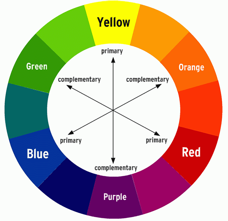
In Jordan's Photoshop class, we worked on some concept art for our cities. I drew out a few different designs which I have published in my last Invisible Cities post. As well as this, we went over colour theory, which was very interesting. I wanted to make a note on here of what we learnt about colour so I'll always have something to refer back to.

We learnt about the basic colour wheel, and we went over hues, tints, tones and shades. What interested me the most was how to pick your colours using different methods. You can pick your colours based on whether they are complementary or not. By doing this, you'll be able to make your art pieces pop a bit more: for example, if you have a red environment and use blue shadows, it'll look a lot more vibrant and interesting, compared to just using a darker red for the shadow (which is what I usually do!)


Toolkit - Timing in Animation

In Nat's lesson last week we worked on timing. I wasn't in this lesson, but I managed to gather enough information to understand what I needed to do! In the GIF below are the examples I've made that I'm pretty sure was covered in Nat's class.


The top ball is travelling at a constant speed from one side of the screen to the other, whereas the one below it eases in, speeds up, and then slows down to ease back out again. To ease it in, you need to include more frames at the beginning, then do less to make it speed up. The class then applied this logic to a pendulum swinging back and forth.


In this pendulum example, you can see that the ball is swinging at a constant speed, and it doesn't really look that natural at all. However, if you apply the 'ease in, ease out' principle to it, and add in an arc to give it a more natural swing, the whole animation suddenly looks a lot smoother:


It was interesting to apply this logic to different scenarios, and I can think of lots of different ways in how it can be helpful in animation, such as a car speeding up and slowing down, a ball, or other objects. Hopefully I've accurately covered all I missed in that lesson, this is as much as I could gather from talking to Nat, my classmates and also looking at their blogs!