Showing posts with label Photoshop. Show all posts
Showing posts with label Photoshop. Show all posts
Friday, 2 March 2018

Thursday, 1 March 2018


Wednesday, 28 February 2018


Wednesday, 7 February 2018
Wednesday, 24 January 2018
Friday, 12 January 2018
Toolkit - X-Sheets & Lip Syncing
In Nat's class last friday we did lip syncing for the first time. I thought it was really fun, especially because I've never done it before! We also learned about x-sheets. Nat set us the task to pick an audio clip from a website called the 11 Second Animation Club, and then animate the lip sync to go along with it. I picked a clip they published a couple of months ago from Star Wars, and started to plan it out on the x-sheet template Nat had given us. Here's my sheet:

To help me with the mouth sketches that I drew out, I went online and looked for a diagram with all of the mouth positions for different sounds, and I found this one which was really helpful.

The link to the website below also helped and gave me some good tips for my first time lip syncing!
http://www.keithlango.com/tutorials/old/lipSync.htm
After I finished my x-sheet I used Adobe Animate to make a start on the animation. I imported my sound file in and used the frames I'd written down on my sheet as a guide... However I noticed that I hadn't got my planning completely accurate, so once I'd drawn the frames I had to reshuffle them a bit to make it actually look right. Here's a sketched out version of my animation that I managed to complete in the lesson. It still needs a bit of tweaking, there's a couple of mouth movements that are a little bit out of time. But for now, it's a good start!
Now I've finished the sketch stage, I want to add some more detail to the character's acting, because at the moment he's just stood like a statue. Hopefully that won't take too long to do, and I can move on to drawing up a cleaner version.
Thursday, 11 January 2018
The 'What If?' Metropolis - Matte Painting Progress GIF
Here is the process GIF for my matte painting. Unfortunately there's not too much to show, since it's not a very detailed painting and it really didn't take very long!


Final Painting

Friday, 5 January 2018
The 'What If?' Metropolis - Texturing & Modelling Progress
Today I've added in the windows to my buildings. I've tried to make it quite organic, like in Haeckel's work, so some of them have windows and some of them don't - I think it looks a lot better that way. Once I have a finished render, I'll go into Photoshop to edit the picture and give the windows a kind of glow effect. This will make them look like there's lights on inside! I also textured the ground plane and completed my matte painting. My painting wasn't too much of a challenge because it's just the sky. I'm a bit sad I didn't include more in my painting, but unfortunately it came as a bit of an afterthought to me rather than a priority. It seems like I have focused a bit more on modelling during the project, and I'm quite unsure whether that was the right decision or not! Here are some pictures to show my progress:
Render after adding in the windows and a floor texture

I quite like the look of the windows, even though they aren't realistic at all. I wasn't sure how to get a window effect so that led me to doing a lot of experimentation with different materials. I settled on a blinn and I played around with the settings to get the image above. They look like pearls to me, and although Haeckel's main interest was in small organisms, he also shows an interest in sea life, and this is what I based the main building in the middle on. The fact that the windows look like pearls I think is quite fitting!
My matte painting

My scene after adding in the matte painting
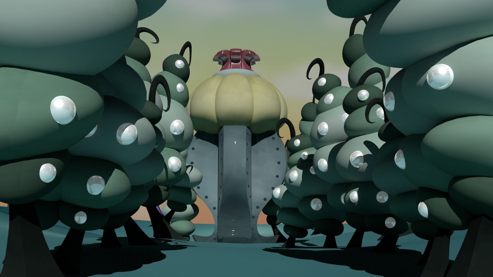
Now I've finished all of the modelling and most of the texturing. I keep on forgetting to texture my lamp posts so hopefully I'll get around to that soon! After that, the only thing left to do is focus on lighting. I haven't been paying too much attention to this aspect until now, and although I have added in a few lights already, I think I'd like to play around with them a bit more to see what kind of effects I can get.
Tuesday, 2 January 2018
2017
Every new year I like to look back on the work I made during those 365 days! Here are some of my favourites from 2017...
January


February

March

April

May

June


July

August

September

October

November

December

Friday, 1 December 2017
The 'What If?' Metropolis - Finished Concept
I've finished my concept art (finally!). I'm a little disappointed because I don't think I like it. I'm having a lot of trouble deciding on colours and I just don't think they look quite right. Or maybe I've just been staring at it for too long? Any advice is welcome! Here's the process, from where I left off on my last post to the finish.


Continuing the shading!

More shading, finishing off the right hand side of the painting.

Starting shading on the left side of the painting.

Finished all shading and final details!

Adding colour

Final piece

Thursday, 30 November 2017
The 'What If?' Metropolis - Concept Art Progress
Still nowhere near where I want it to be yet... But it's getting there! One thing I didn't anticipate was that it would be such a drag to redo work you've lost. Because you've already done it you don't really want to do it again! I'm really hoping I can get this done by the end of the week, I've been spending every minute of my free time just trying to get it back up to speed! Here's a few more progress pictures.
Starting the shading on the floor and buildings

More shading!

Monday, 27 November 2017
The 'What If?' Metropolis - Concept Art Progress
After my previous concept art piece corrupted I felt really unmotivated to start all over again. I've had a bit of a wobble mentally/emotionally too so I've been behind on getting this finished. I don't want that to be an excuse though and I'm determined to catch myself up before the end of this week! (hopefully earlier than that, though!)
This is what I've managed to get done so far. It's not much, but I wanted to post it so I have some kind of work flow on my blog. I want to get into the habit of doing this because if I lose any pieces in the future I'll have something to show for it, even if I don't have the final product.


I started with a very messy sketch that I managed to salvage from my old corrupted file.

I went straight from the sketch to blocking out the houses, adding more detail as I went along. I want to get the basic idea down first, then I plan to add shading and colour at the end.

I moved from the right side to the left side of the painting, and started to fill that in too. I wanted to do the main building in the middle last so I can compare it to the other structures I have. I can then use this knowledge to make the main building stand out more from my houses.

This is the point I'm currently at! I've finished doing all of the houses, I just need to tackle the middle building and the floor/sky. Then I can work on colours and finally finish my concept!

Friday, 24 November 2017
Toolkit - Parallax
In Simon's lesson today we experimented with the parallax effect in Photoshop and After Effects. We started with a painting that we had divided into foreground, middle ground and background. Then, in After Effects we imported in the Photoshop file and made a video to make it look like the painting was moving! Here's the painting I did in the lesson (not very finished!) and the final video. This is definitely something I'd like to try again in the future!


Wednesday, 22 November 2017
The 'What If?' Metropolis - Orthographs
The finished orthographs for my city! I really liked doing these, and I feel like they came out really well.


Tuesday, 21 November 2017
The 'What If?' Metropolis - Production Art
Finally finished my production art and my orthographs ready for tomorrow! Here's the production art, as well as a bit of the processes I used. I already made a post showing my production art of the houses that will be in my scene, and I asked for some feedback on colours. I've decided to go with the turquoise colour scheme, so here's what the final version looks like:

Then I did the art for the street lamps in the city. I started with the sketches I'd made from my thumbnails and then made a coloured version which looked like this:

However I really didn't like these lamps... They just didn't look right! So I did a bit of tweaking. I changed the light area to a teardrop shape instead of an oval and it made such a nice difference. I also made the lamp post a bit darker. Here's my final production art for the lamps!

After this I moved on to the main building that will be in my scene, and it'll probably be the centre of attention because of its size and design. This is the building where all the 'perfect' people live, so it needed to be a bit brighter than the rest of the city. I used dark blues, turquoise and yellow to make it light up a little more. To make sure it was completely symmetrical I drew one side first and then mirrored it to have it look 'perfect' in that way. Just what Ernst Haeckel would have wanted!

Those are the three main assets that will be in my city! I will be having a lot of different versions of the houses by using distortion and sizing tools to make them all similar but a bit different. All of the lamp posts will be the same and line the streets, and the main 'perfect' building will hopefully be the most central feature to my city to show the dystopian/utopian viewpoint. Next post showing my orthographs will be up soon!
Monday, 20 November 2017
The 'What If?' Metropolis - Coloured Production Art
I'm currently finishing off my production art ready for the OGR on Wednesday and I took some time to add different colours to my houses to see which scheme works the best! The first one is the original black and white version that I started with, then I used an overlay layer on top of the original and coloured the drawings in. Which colour would you pick?
Original

Blue

Turquoise
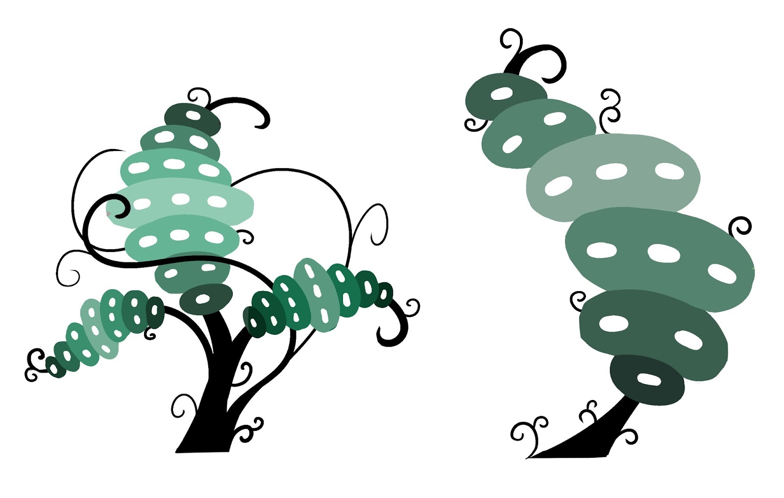
Purple

Green

Subscribe to:
Posts (Atom)