Sunday 28 January 2018

Toolkit - Introduction to Animation

Rigs

Motion Paths

MEL

Dynamics

Toolkit - Pre-Visualisation Continued

Camera Shake
Pass By

Shake Drop


Contra Zoom


Toolkit - The Sound Room

Today Kat showed us the sound room, and told us how to book it if we needed to. I found it really interesting and am excited to have a go in there myself. I really enjoy recording music at home so maybe I could try it in the sound room to get higher quality files.

After looking at the sound room, we started to work on making computer-generated sound in Audition. I really liked trying out all of the different kinds of sounds you could get using the computer. Here's what I ended up with after a bit of experimentation:


Wednesday 24 January 2018

From Script to Screen - Online Greenlight Review


Toolkit - Adobe Space Sound Effect

In Kat's previous lesson I was absent but I caught up on what we did today. In the lesson, everyone worked on noise reduction and editing clips to make them clearer. After that, they started work on a space themed sound clip. Here's the one I made:

Thursday 18 January 2018

From Script to Screen - Idea Development

Here's a bit more of a story for my idea. It's a bit different from the first development post I made, so let me know if you think I'm going in the right direction!

The animation opens on an office worker at his desk. He is approached by his boss and is let go from his job as the company is cutting down on staff. The man packs his things, leaves the office tower block and goes home to his wife and daughter. The daughter is out in the garden playing with her skipping rope and, to raise his spirits, the man goes out and plays with her. They have fun outside for the rest of the day, but as the next few weeks pass, the family begins to struggle - they're running out of money quickly and the man can't find a new job fast enough. He becomes more and more depressed and goes through so many interview rejections that he begins to give up on job hunting and spends more time in his home without the energy to even get out of bed. The next scene cuts to the outside of the house with a 'for sale' sign up and the little girl and her mother looking out of the window at it The girl looks sadly at her dad slumped on the sofa. Suddenly the little girl has an idea. She goes up to her parents' room where she spends some times rummaging, until she finds what she is looking for and pulls out an old box from under the bed. As she goes through the box, you see that it's full of clown props and clothes. The girl finds a picture in the box which shows her dad as a young boy, clutching an old skipping rope and looking up at an older man, his father, who is dressed in the clown outfit. The girl brings the picture downstairs and shows her dad, who smiles at the photo. The little girl then hands the dad her skipping rope. Her dad takes the picture and the rope and stands up from the sofa, looking determined! The next scene shows the house again, and this time the 'for sale' sign has been taken away. and replaced by a sign that reads 'clown and party organiser for hire'. In the back garden, there is a party, with balloons, decorations and a cake. In the middle of the garden is the man, dressed up as a clown, skipping whilst blowing up a balloon in the middle of a crowd of kids who are clapping him on. When the party ends, the man's wife takes a photograph of her daughter him together that resembles the picture from the previous scene. The animation ends by zooming in on this picture, which slowly fades out into the older picture of the man and his father from many years ago.

It seems quite long when you put it down in writing, but I think I could fit this into two minutes. I just hope the story seems good!

Monday 15 January 2018

Toolkit - Pre-Visualisation Continued

In Simon's class today we continued with pre-vis shots. Here's the playblasts from the lesson:

Distance and Tracking
Shot 1

Shot 2

Shot 3

Shot 4


Camera Coverage
Individual Shots


Final Edited Scene

From Script to Screen - Idea Development

Following Phil's comments on my last post regarding this project, I've tried to develop my best idea a bit more to see what everyone thinks.

A clown is working at a little girl's birthday party (where the skipping rope prop is) but messes up (possibly knocks over the cake? Causes a commotion, etc) and gets fired from the party company that he works for because of all of the bad press he is creating. Now unemployed and alone the clown becomes homeless and decides there's no other way out but to commit suicide. He climbs to the top of a tower block of flats and is preparing to jump when the little girl from the party appears - she lives in the block of flats that he's about to jump from. She begs him not to jump and the clown hesitates but eventually takes her hand and steps down from the edge.

It doesn't really have a proper ending yet, and it's quite a dark story, especially for me since I usually do lighter fantasy animations. But I'm trying to view it as trying something new that I haven't done before: and it's certainly something new to me. What do you think?

Friday 12 January 2018

Toolkit - X-Sheets & Lip Syncing

In Nat's class last friday we did lip syncing for the first time. I thought it was really fun, especially because I've never done it before! We also learned about x-sheets. Nat set us the task to pick an audio clip from a website called the 11 Second Animation Club, and then animate the lip sync to go along with it. I picked a clip they published a couple of months ago from Star Wars, and started to plan it out on the x-sheet template Nat had given us. Here's my sheet:


To help me with the mouth sketches that I drew out, I went online and looked for a diagram with all of the mouth positions for different sounds, and I found this one which was really helpful.


The link to the website below also helped and gave me some good tips for my first time lip syncing!
http://www.keithlango.com/tutorials/old/lipSync.htm

After I finished my x-sheet I used Adobe Animate to make a start on the animation. I imported my sound file in and used the frames I'd written down on my sheet as a guide... However I noticed that I hadn't got my planning completely accurate, so once I'd drawn the frames I had to reshuffle them a bit to make it actually look right. Here's a sketched out version of my animation that I managed to complete in the lesson. It still needs a bit of tweaking, there's a couple of mouth movements that are a little bit out of time. But for now, it's a good start!


Now I've finished the sketch stage, I want to add some more detail to the character's acting, because at the moment he's just stood like a statue. Hopefully that won't take too long to do, and I can move on to drawing up a cleaner version.


Film Review - La Jetée

Le Jetée, made in 1962 by Chris Marker, is a very matter-of-fact film about time travel, told through picture instead of animation. Although it may not look like much to a modern audience, the film has been a large influence in movie culture, inspiring many other films after it, like Back to The Future or Star Trek.

Fig. 1
Like a moving storyboard, Marker only uses the essential pictures to tell his story. The lack of movement can be disconcerting at first, but as the film progresses it is obvious that the photographs are just a unique, creative way of telling a remarkable story. Unlocking the "poetic possibilities" (Scott, 2012) of time travel was essential to the short film's success, and gave it the influence it still has on other film makers today.

Fig. 2
The sound is La Jetée is utilised well to enhance the pictures on the screen. "The film uses sound and visuals together to explore the concept of movement" (Ignoramus, 2018). Despite not having any movement in the movie (apart from in one short scene), La Jetée doesn't come across as being unfinished, or having anything missing. The audience begins to get used to the new format, and can almost fill in the gaps themselves. The sound helps incredibly with this. When in an underground scene where the main character is being used as a guinea pig for time travel, the harsh whispers in the background makes the picture seem even more alive, almost as if you were standing in the scene yourself.
Not only are the photographs and sound remarkable in the film, but the story is also inspiring, and creates "meaning and an emotional connection" (Buchman, 2015) to the main character. The twist at the end is poignant to the audience, and leaves them thoughtful, perhaps sad for the time traveller. La Jetée is a well thought out and delicate film that uses unconventional methods to make a story come to life.

Fig. 3

Bibliography
Buchman, M (2015). "Classic Films: La Jetée" in Nerdist [online]. Available at: https://nerdist.com/classic-films-la-jetee/
Ignoramus, L (2018). "Chris Marker’s La Jetée Analysis: Mortality and the Illusion of Time" [online]. Available at: http://filmslie.com/chris-marker-la-jetee-analysis-temporality/
Scott, A (2012). "What ‘Back to the Future’ and ‘Terminator’ Owe to ‘La Jetée’" in The New York Times [online]. Available at: http://www.nytimes.com/2012/09/30/magazine/la-jetee.html

Illustration List
Fig. 1 - https://upload.wikimedia.org/wikipedia/en/thumb/f/f7/La_Jetee_Poster.jpg/220px-La_Jetee_Poster.jpg
Fig. 2 - https://nerdist.com/wp-content/uploads/2015/09/lajetee6_090515.jpg
Fig. 3 - https://wolfmanscultfilmclub.files.wordpress.com/2017/04/la-jetc3a9e-1962-man-and-woman-the-jetty-airport.jpg?w=1100

From Script to Screen - Ideas

I've tried to come up with a few different ideas for the 'From Script to Screen' project. I'm not sure whether any of them are really that great though, so opinions are welcome! I've numbered all of my ideas below so you can pick your favourite and write the number down in the comments :)

1. An office worker looks for a more exciting career which leads him to become a clown
2. A class clown/bully who is superior at school but behind the scenes at home he is inferior and living in poverty
3. A strange clown ghost who haunts a tower block of flats... Everyone thinks that he's really scary, but he just wants to make friends
4. A sad clown goes on a quest to become happy again
5. Clown jumps off a tower block after being fired from his job - animation shows the story of how his life went from amazing to horrible to his death, where he's skipping and the camera zooms out to show him skipping on the edge of a building before he jumps

What does everyone think? Coming up with ideas is my weakness so any help is really appreciated. None of them really feel right at the moment, but I'm not quite sure what's missing?

Thursday 11 January 2018

Film Review - Suspiria

Suspiria is a 1977 horror film, directed by Dario Argento. It follows a young dancer as she moves to Germany to go to the most acclaimed dancing school there. However, she finds out that something sinister is happening underneath the seemingly perfect façade.

Right from the beginning of the film, Argento makes the audience feel uneasy about what the audience is about to get into. As soon as the main character, Suzy, arrives at the airport, there is a fascinating scene where it switches between her in the airport, which features normal, everyday music, to the outside, where it is pouring down with rain and a far more alarming soundtrack is played: Argento's "own rock score (all dissonance and heavy-breathing) blasts out in stereo" (SM, no date). This foreshadowing of what is to come is so simple and subtle, but already sets the tone for the film.

Fig. 1
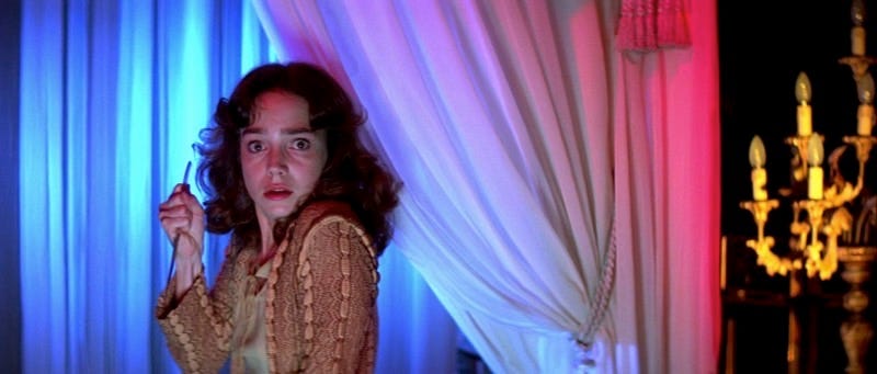
The use of colour in Suspiria can only be described as making the film even more "unique, surreal, [and] hyper-intense" (Smith, 2000). The vivid red is everywhere, spelling out danger ahead. The colours are strong and unapologetic, and even though they are so unrealistic, it still fits well into the film overall. Along with the deafening rock metal track and the bright colours splashed across the screen, Suspiria is certainly a unique film in the way it has been pieced together.

Fig. 2
Although Argento kills off many women in the film, which some argue is misogynistic, he also creates a heroine, which is perhaps his redeeming feature. "The character of Suzy is initially seen as hopelessly naive, but grows to become a strong, capable person." (Ebert, 2017). For a film made in 1977, it shows a very intelligent female lead, who ultimately cracks the case on the secret behind the dancing school.

Fig. 3

Bibliography
Ebert, R (2017). ""Do You Know Anything About Witches?" "Suspiria" at 40" in Roger Ebert [online]. Available at: https://www.rogerebert.com/balder-and-dash/do-you-know-anything-about-witches-suspiria-at-40
Smith, A (2000). "Suspiria Review" in Empire [online]. Available at: https://www.empireonline.com/movies/suspiria/review/
SM, (no date). "Suspiria" in Time Out [online]. Available at: https://www.timeout.com/london/film/suspiria

Illustration List
Fig. 1 - https://blogger.googleusercontent.com/img/b/R29vZ2xl/AVvXsEiAy-8ZWQ20gQcar3zq1s5j-4wMV0sXJ6CByb1rxVdCV5XOqZMd0YQp7wvBLHhSg1KVNpC9x9HVGPYx1Rt9SMDg1bBZYVrFfnWVA8khQXn_JOV4A6SM1UWcDF9sP97gSMbnRlWv_JzGWEE/s1600/suspiria2.png
Fig. 2 - https://filmgrimoire.files.wordpress.com/2015/02/suspiria-214.jpg
Fig. 3 - https://i.kinja-img.com/gawker-media/image/upload/s--KtBhO-67--/c_scale,fl_progressive,q_80,w_800/mq7objrqlxbxzd9zxkwz.jpg

Film Review - Repulsion

Repulsion was made in 1965 by Roman Polanski. It features a young woman descending into madness in her flat and also shows her repressed fear of men and their sexual advances. The surreal design in the film helps the audience to understand Carol and her hallucinations, and also helps the viewer to see the decaying state of her mental health as the days pass.

Fig. 1
From the very start of the film, the audience can see that Carol's mental state may not be very stable. As the story progresses and her sister leaves on holiday, isolating Carol in her flat, Polanski creates distinct parallels between "the decay of her mind with the rotting of a rabbit she intended to cook but has just left out on the sideboard." (Newman, 2015). This image helps to show the time passing in the flat, as well as how Carol's hallucinations gradually get worse and lead her into a deep madness.

Fig. 2
Along with the strong images Polanski uses to show the gradual passing of time, he also employs sound to emphasize Carol's madness and make the audience feel uneasy. Many examples include "the ticking of a clock, the voices of nuns playing catch in the convent garden, the dripping of a faucet." (Morgan, 2011). This is the only connection that Carol has to the real world, and this helps Polanski to fashion a bubble of isolation that both Carol and the audience are trapped in.

The idea of Carol murdering two, probably strong, men is a progressive one. Despite being a woman Polanski has no problem with transforming Carol into a deranged and dangerous person, who seriously harms the men who "unwittingly invade" (Crowther, 1965) her flat. The invasion of the men into her personal space, like her suitor literally breaking the door down the get to her, is very telling of how the world once worked in the way of gender equality. The men intruding is something Carol doesn't want, and this is probably relatable to a lot of women. The fact that these men so brazenly disrespect Carol's space could be a big driving force behind her murdering them.

Fig. 3

Bibliography
Crowther, B (1965). "Repulsion" in The New York Times [online]. Available at: http://www.nytimes.com/movie/review?res=ee05e7df1739e471bc4c53dfb667838e679ede
Morgan, K (2009). "Roman Polanski Understands Women: Repulsion" in Huffington Post [online]. Available at: https://www.huffingtonpost.com/kim-morgan/roman-polanski-understand_b_301292.html
Newman, K (2015) "Repulsion Review" in Empire [online]. Available at: https://www.empireonline.com/movies/repulsion/review/

Illustration List
Fig. 1 - https://upload.wikimedia.org/wikipedia/en/8/89/Repulsion_%281965_film_poster%29.jpg
Fig. 2 - http://www.thingswewatch.com/wordpress/wp-content/uploads/2016/03/repulsion1_tww.jpg
Fig. 3 - https://medialifecrisis.com/files/images/articles/201509-Popgap/Repulsion-1965/Repulsion-1965-01-08-34.jpg

Film Review - The Shining

The Shining is a classic horror film made in 1980 by Stanley Kubrick. The story covers Jack who takes his family to the Overlook Hotel in the isolated mountains over winter. However things soon become less than ideal when Jack begins to let madness take over, and very soon his wife and son are in danger.

Fig. 1
Described as "deeply scary and strange" (Bradshaw, 2012), Kubrick really makes the most out of every shot taken in the film, and one of the most effective ways in which he does this is through the set design. Patterns, especially on the floor, are everywhere. Kubrick obviously thinks deeply about his set and creates these patterns to perfectly frame a shot or to change a mood. One of the most interesting uses of this is where Danny, Jack's son, is playing with his model cars on the carpet, and the lines from the carpet are almost wrapped around him, making him look even smaller and more vulnerable than he already is.

Fig. 2
Not only does the set convey the feeling that something isn't quite right in the film, but "the actors themselves vibrate with unease" (Ebert, 2006). This is partly due to the fact that Kubrick would make the actors do take after take for just one scene, until it was perfect and exactly how he wanted it. The toll this must have taken on the actors is obvious, especially when you're recording the same thing for months on end. The anger portrayed in the film could very well be real anger, and the tears could be real tears. Kubrick really pushed his actors to the edge to create The Shining, tormenting them in their own way, possibly to make the characters even more believable than they would otherwise be.

Fig. 3
The use of sound in The Shining also sets the audience on edge. A review states that "The Shining may be the first movie that ever made its audience jump with a title that simply says "Tuesday."'"(Maslin, 1980) Kubrick really pushes the sound, and this sucks the viewer into the film, engages them, and most of all, scares them. Even simple sounds, like Danny riding his tricycle on the carpet and then changing to the wooden floor, can make you jump. Kubrick has perfectly orchestrated sound and picture with such precision to captivate the audience, and to make the horror of the film even more believable.

Bibliography
Bradshaw, P (2012). "The Shining - review" in The Guardian [online]. Available at: https://www.theguardian.com/film/2012/nov/01/the-shining-review
Ebert, R (2006). "The Shining" in Roger Ebert [online]. Available at: https://www.rogerebert.com/reviews/great-movie-the-shining-1980
Maslin, J (1980). "The Shining" in The New York Times [online]. Available at: http://www.nytimes.com/movie/review?res=EE05E7DF1738E270BC4B51DFB366838B699EDE

Illustration List
Fig. 1 - https://static1.squarespace.com/static/5262aa63e4b0fe976f8d0490/53f10697e4b097fb5ada11b1/53f10697e4b097fb5ada11b4/1408304811722/shining_ver1_xlg.jpg
Fig. 2 - https://media1.popsugar-assets.com/files/thumbor/Ffvu6C-mPurTZBQnI_cPu8u3y2E/fit-in/1024x1024/filters:format_auto-!!-:strip_icc-!!-/2015/10/08/831/n/1922283/91691e258478e6c9_maxresdefault_copy/i/very-similar-Shining.jpg
Fig. 3 - http://dl9fvu4r30qs1.cloudfront.net/0e/a4/f2f7f87042b39ae684bef302a61a/the-shining.jpg

The 'What If?' Metropolis - Reflective Statement

This project has been a big challenge for me. The workload is so different than what I'm used to and I've been finding it hard to keep up. However, I feel like I've learnt so much from this experience that I'll be able to apply to the next project. And overall, despite all of the stressful times, I've enjoyed this project.

At the beginning of the WIM project I was a bit skeptical that I'd be able to get everything done in time. There is a lot of work and I'm a major perfectionist so I can spend ages on just one piece. After the setback of losing my concept art after the file corrupted, I was even more uneasy with the workload. However, looking back on all of these issues I think all of this was a good way to test my commitment to the project, as well as help me learn some essential skills I need to get work done. I can't be too much of a perfectionist when I've got a tight deadline, but I can still get the work to a stage where I'm happy with it. I also know now to keep multiple backups of one file.

I've had a lot of problems with motivation throughout the project, and at times I've felt a bit like I've been stuck in mud, but towards the end I started to feel a lot better about my work and what I'd achieved. I now feel a lot more clear-headed and I'm ready to start the next project armed with the knowledge I gained throughout term one.

In terms of things that went well during the project, I think my finished product looks really nice and I'm proud of the fact that it actually looks like the concept art I created. I put a lot of effort into my thumbnails, and I got to 100 when last project I only got to about 60. That's a big improvement in my eyes!

Things I could improve on would definitely be my concept art. I regret losing my original drawing so much and I could just never quite replicate the drawing when I tried it again the second time. I'd never had a Photoshop file corrupt before, and I never want it to happen again! This is especially dangerous when working on really big projects. I'm so wary about saving my files now, and when I was working on my 3D version of the city, I made sure to have at least one up-to-date backup of my work.

If I could do the project all over again, I'd definitely change a lot. I wish I was more organised about when to do my work, as I spent a lot of time sitting and worrying about the work instead of actually doing it. I think next time, I'd benefit from writing a timetable for myself so I know what to do and when so I can stay on track.

Overall, although my WIM has been a bit of a bumpy ride, I feel like it's been a real turning point for me in terms of my motivation, art and organisation. I'm very excited to make a start on the next brief to show what I've learned!

The 'What If?' Metropolis - Thumbnails 77-100

I seem to have forgotten to put these thumbnails up on my blog, so here they are! I had some trouble with the scanner, I just couldn't seem to get a scan that was high quality. So I've taken some pictures instead.


The 'What If?' Metropolis - Production Designer Research

Research on my Ian Gooding, who most recently worked on Production Design for Moana.

The 'What If?' Metropolis - Matte Painting Progress GIF

Here is the process GIF for my matte painting. Unfortunately there's not too much to show, since it's not a very detailed painting and it really didn't take very long!


Final Painting

The 'What If?' Metropolis - Travelogue

My travelogue is in one of my OGR's, but I've edited it a little bit for more clarity and description of my city, so here is the updated version.

Alptraum is a city of secrets: on the outside, a beautiful utopia, with shiny, curved buildings and glistening streets. However, look closer and you’ll see a side harder to notice. The city is perfect – a bit too perfect. Everybody looks the same, a model human, a perfect human. Rejected, imperfect citizens cower and hide behind the buildings, living like vermin. In the middle of the city stands a large, tall building, gleaming attractively. This is the centre of Alptraum, where only the elite can live: they don’t just need to be perfect to be worthy, they need to be even more than perfect. The rest of the buildings, lower down, seem to reach up to this centre monument: they twist and turn, slowly clawing up to this perfect structure, someday hoping to reach the top. This is a fruitless effort, however. No person or structure will ever reach as high as the centre of the city. The lesser beings live in a desperate limbo. Trying to be perfect, but never quite getting there. Being shunned by the community. Despite the pleasant exterior, when you see the hidden horrors of Alptraum they are hard to unsee.

The buildings of the city are mysteriously silent, as if they are trying to hide the secret society that lives within. The whole city is surrounded by gleaming gates, keeping out the dregs of society. They move around the gates like zombies, with no hope of ever getting in but never quite giving up.
The buildings in Alptraum are some of the most unique structures you would see for miles. Organic, yet utterly perfect. If it had been made by mother nature herself, perfectly natural and beautiful without even trying. However, knowing this is man-made, when looking at the buildings all you can think of is the pain and sweat that went into constructing such perfect and balanced structures. Of course, this would have been the work of the lesser beings in the city. The imperfect ones will slave away all day, trying their best to claw their way up the social ladder, yet never moving up even one rung. If you are born into a lower class, that is where you stay. Being judged on how you have been born is harsh; but the citizens of Alptraum view it as normal. It’s just how the world works. It’s natural to be oppressed if you aren't the epitome of the perfect human being. The rigid social structure in this city is proudly displayed like a banner across the whole city. Anyone that visits Alptraum will know this is how the city functions. The perfection of the city seems too fragile, as if the whole society could come crumbing down at any moment. And maybe, someday, it will.

Like living in a waking nightmare, the citizens carry on with their daily lives, making sure they walk perfectly, talk perfectly, move with such absolute precision that they could be mistaken for robots. Each building is different but the same: with different aspects of beauty, but when looking beyond this they all look monotonous and eerily identical. It’s as if someone has tried to be different, and decorate these buildings in an interesting way, and then failed. The streets are so clean they seem to shine – the floor is incredibly smooth, like marble. The path is immaculate. So immaculate that nobody dares step on it, despite that being its purpose. Most outsiders, practically all of the outsiders, aren't allowed into this city so all you can do is stare at it from the outside: you’re not perfect enough to enter. You fear if you set foot in through the gates and break this rule, you’ll become just like the lesser citizens. Forced to scramble for survival, hiding in the shadows, seen but not heard. Ignored.

You begin to walk away from this city hidden on the top of a mountain, and as you walk away a mixture of fog and soft sunset light consumes it, almost making it disappear. What doesn't disappear is the feeling of gloom and oppression that follows you, even as you walk away. Alptraum may seem like a dream, but if you dare to enter the city, and hear the gates thud closed behind you, you’ll realised that you've actually just stepped into a nightmare.

The 'What If?' Metropolis - Art of Alptraum


Wednesday 10 January 2018

Toolkit - Non-Linear Deformers

In Simon's previous class we had a look at non-linear deformers and what they can do when modelling in Maya. We tried each of the options in the menu and I thought they all did really interesting things! In future I think it'd be fun to make an animation using the deformers because I looked a bit like they were dancing when you rotated them around! Here's some screenshots on the experimentation we did this lesson.


Simon also asked us to look at the deformer tutorial online, which I had a look at and also found really interesting. It talks more about using the deformers in animation, which is something I'd definitely like to experiment with in the future.

From Script to Screen - My Three Words

We all got the brief yesterday, along with the names of the three things we need to include in our animation. I can't say I'm happy with mine, but I'm trying to see it in a positive way, and I'll see what I can do to work with them when coming up with ideas!

Character : Clown
Place : Tower Block
Prop : Skipping Rope

Soundscapes - My Images

Here are my three images that I got for the Soundscapes project, and a few different words I've come up with to describe them:

Number 1

Fuzzy, Soft, Spongy, Cozy, Fibres, Hair, Dirty, Red


Number 2

Abstract, Colourful, Bouncy, Excited, Broken, Splotchy, Merging, Mermaid


Number 3
Organic, Medical, Small, Serene, Calm, Black, Single

Character Design - First Lesson

Today was our first character design lesson. I learnt a lot from the presentation and activities today, and I made a lot of notes so instead of typing everything out I thought I'd put images in of all of the notes I have!


As you can see we covered lots of different subjects like archetypes, and style. The first exercise was to take a character and use shapes to make them look different. As I explained in my notes,  there are three main shapes that we use to make characters: circles, squares and triangles. I was given The Hulk as my character, and since he's already square, I tried to make him more circular, and then more triangular.

For the second exercise, we had to change the style of my character. As you can see below, I chose Steven from Steven Universe and tried to make him a little more detailed/realistic!


I really enjoyed this lesson and I'm looking forward to the next one - character design is something I'm really interested in learning more about.

Toolkit - Adobe Dragon Roar

Today was our first Adobe Audition class, and I've found I'm not very good at editing sound, even if it interests me! The lesson started with Kat teaching us about different kinds of sound, about foley, and ambient sound. After this we worked on making a dragon roar, using animal audio clips, based on the picture of a dragon we found. I decided to use one of my drawings because I couldn't really find anything I wanted.

However the sound I made didn't really match my dragon at all. In fact, it didn't really sound like a dragon. It's a bit of a mish mash of strange noises. I don't think there's a way to upload audio files in Blogger - I'm not sure if anyone else has found out a way? Because of this I've taken it into After Effects and exported the picture of my dragon and the audio into a quicktime file that Blogger will recognise. Here it is:


I'm trying not to be too bothered about how bad it is, since it is the first lesson after all. Hopefully I'll improve next week!

Toolkit - Pre-Visulisation


In Simon's Monday Maya lesson we looked at pre-vis. After explaining all of the features of pre-vis, we worked on different animated camera shots and playblasted the finished examples.

Pan Rig Playblast


Staircase Rig Playblasts
180 Degrees:

360 Degrees:

720 Degrees:


Pitch Rig Playblast


Dolly Rig Playblast


Crane Shot Playblast

Monday 8 January 2018

The 'What If?' Metropolis - Final Render


My final scene for The 'What If?' Metropolis project!

The 'What If?' Metropolis - Texturing, Lighting & Final Scene Progress

I'm finished! I textured my lamp post first of all, and then duplicated it two times more to spread along my scene. I quite like how they look hidden behind the houses: they're not too prominent but they still add something, especially when adding a glow on in Photoshop! Here's the progress pictures:

Adding in the lamp posts and the final render

Image after adding effects in Photoshop

As you can see, the final image is a tiny bit darker and I've added a glow to the lamp posts and the top of the main building. I was going to add it to the windows too, but I think if I did that it'd be like the whole image is glowing which isn't really what I was going for! I'm happy with this final image, I think it resembles the concept art quite nicely. I'll make a separate post dedicated to just the final render instead of having it buried in my progress posts forever.

Friday 5 January 2018

The 'What If?' Metropolis - Texturing & Modelling Progress

Today I've added in the windows to my buildings. I've tried to make it quite organic, like in Haeckel's work, so some of them have windows and some of them don't - I think it looks a lot better that way. Once I have a finished render, I'll go into Photoshop to edit the picture and give the windows a kind of glow effect. This will make them look like there's lights on inside! I also textured the ground plane and completed my matte painting. My painting wasn't too much of a challenge because it's just the sky. I'm a bit sad I didn't include more in my painting, but unfortunately it came as a bit of an afterthought to me rather than a priority. It seems like I have focused a bit more on modelling during the project, and I'm quite unsure whether that was the right decision or not! Here are some pictures to show my progress:

Render after adding in the windows and a floor texture

I quite like the look of the windows, even though they aren't realistic at all. I wasn't sure how to get a window effect so that led me to doing a lot of experimentation with different materials. I settled on a blinn and I played around with the settings to get the image above. They look like pearls to me, and although Haeckel's main interest was in small organisms, he also shows an interest in sea life, and this is what I based the main building in the middle on. The fact that the windows look like pearls I think is quite fitting!

My matte painting

My scene after adding in the matte painting

Now I've finished all of the modelling and most of the texturing. I keep on forgetting to texture my lamp posts so hopefully I'll get around to that soon! After that, the only thing left to do is focus on lighting. I haven't been paying too much attention to this aspect until now, and although I have added in a few lights already, I think I'd like to play around with them a bit more to see what kind of effects I can get.

Tuesday 2 January 2018

2017

Every new year I like to look back on the work I made during those 365 days! Here are some of my favourites from 2017...

January


February

March

April

May

June


July

August

September

October

November

December