Monday 11 December 2017

The 'What If?' Metropolis - Final Scene Progress

Now I've finished UV mapping my main objects, I created my final scene and put in the ground plane, and then imported my two buildings into the scene. Here is a view through the final render camera without and with the UV map texture:


There's still a lot left to do, and I'm going to move on the modelling my lamp post next so I can put that into the final scene too. After that I'll need to start thinking about my matte painting. Hopefully, that shouldn't be too hard to complete as most of my scene will be made using actual models, so all that I'd be painting is the sky, possibly with the few background buildings, depending on whether I think the scene needs that or not.

The 'What If?' Metropolis - UV Mapping Progress

After finishing the UV mapping for my house, I moved on to unwrapping the main building. I had a bit of help from Simon for this as I'm finding doing UV's really challenging. I just can't wrap my head around it! Here is the finished UV for the main building:


One thing you might notice is that I've deleted the top swirls from the building. I really didn't like the way they looked so I decided to get rid of them. Instead, I've done a bit of experimenting of what I can put on the top of the building and I came up with a nice solution in the image below! I actually made this by taking one of the bottom structures, duplicating it, and turning it upside down. I made a few different tweaks, like scaling certain faces to make it fit in nicely. I like this variation a lot more than the swirls, as I think there was too many of them which made it a bit confusing (and it looked messy!).


Sunday 10 December 2017

The 'What If?' Metropolis - Modelling & UV Mapping Progress

On Friday I worked on finishing off two of my models and starting UV mapping. Here's how it's going so far:

Finishing off my main building model

The finished UV map for the house


It was also advised by Jordan this week that I make a 'grey box' model so I know about the placement of everything in my scene. I've done this just using simple cylinders. All of the buildings except the middle one is a variation of the UV mapped one I've done above - Simon told me to focus on just one first, and then I can change the shape of it after it's all textured, so I don't have to worry about texturing every single one: it can just be duplicated with the existing textures instead!

Grey box model test one

Grey box model test two

Monday 4 December 2017

Contextual Studies - The Impact of Technology on Art

In our most recent contextual studies lesson we looked at technology's effect on art. The main question we asked was whether technology has destroyed or enhanced arts/life. We had a look at what the world was like before photography, film or computer animation arts.

We looked at three philosophers in the lesson; Walter Benjamin, who said technology was having a bad impact on art, Marshal McLuhan who states that 'the medium is the message', and Jean Baudrillard, who had an interest in hyper reality, and how that could lead to losing contact with the real world.

The arts, however, was trying to do something that technology is now doing today - it wanted to make things realistic for the viewer. This is achieved easily by CGI in the modern day. We also looked at the development of self portraits now that technology has been introduced. We looked at Van Gogh, Andy Warhol and then the latest development of selfie sticks. Looking at these examples, we noticed a difference behind the meaning of self portraiture: Van Gogh is trying to capture emotion, Warhol is trying to replicate images, whereas taking a selfie is all about looking good.

So, do we care more or less for the images we create? I think we care less. It's easy to take a quick snap and then delete it if you don't like it. If you were taking a photo with an older camera it would be a painstakingly long process to get a perfect photo. However, nowadays if you take a bit of a rubbish photo you can always enhance it using Photoshop. Before, we couldn't do that, so photographers had to be very precise and skilled.

We also had a look at reproduction. The Mona Lisa has been reproduced many times, had lots of photos taken on it, and been put on Google. So why would you go and see the real painting if you've already seen it online? The answer is that most people wouldn't. By using reproduction in this way you are losing the uniqueness of the image.

The last thing we looked at was the 'Avatar' blues. It is the concept that films are so amazing that when you've finished watching it and go back to your less amazing life, you actually end up more depressed than you started. Movies are becoming a kind of escapism for people, and some viewers would rather be in the movie than in real life. This is a problem because more and more of the population will be left longing for something that they can't have. Are we becoming too reliant on film in this way?

Contextual Studies - Rabbit in The Headlights

In this contextual studies lesson we looked at how film communicates different concepts. We learnt the definition of semiotics, which is the study of signs, and how this is used to signify different things in film.

We got a few different points on how to 'read' and image for film review:
-colour
-light and shade
-form
-composition
-line
-tone
-setting
-symbolism
-character analysis
-reference to other paintings or films
-image context and content

We also took some pointers on what the main components are in a film review:
-condensed plot synopsis
-background information of the movie if needed
-set of arguments and analysis of those arguments
-evaluation
-motivation (how it is composed, etc)

As well as this, we learnt about different functions of film reviews; for journalism, advertising, criticism, and rhetoric. After this we had a look at mise-en-scene and what this means. The definition of this describes everything that appears on stage - props, characters, even the set.

We used our new knowledge of what mise-en-scene was to analyse The Wizard of Oz. We looked at the use of colour in the film and how it corresponds to the birth of technicolor. The set design also says a lot about the film and the time it was made in: all of the props are plastic and fake, and unrealistic. In a period where times were hard for the people in America, it was nice to escape to a crazy, colourful world of Oz where they could try and forget about the nightmare of daily life. Sound is also something that plays a part. There are two kinds of sound; diegetic, which is when you hear the real sounds that go on in the film, or non-diegetic, which is when you hear sound imposed over the top of the footage you're watching.


We were asked to work on our essays and they're due in this week, so I'll post that up onto my blog soon too!

Contextual Studies - Genre Part 2

In contextual studies we had a look at documentary and melodramas. We started with documentaries, having a look at where it all originated from. There are actually paintings that are used for documentary practices, something which I found interesting because I'd never thought of a painting being used in this way before. The common perception about documentaries is that all of the information in it must be true. However, we found out this wasn't the case. Even before things like Photoshop and editing, photographers would often manipulate objects in the scene before taking a photo. One example of this is Matthew Brady's picture called Federal Dead on The Field of Battle. It was taken in 1863, and is shown below:


Obviously this photograph was taken before the editing technology that we use today had been developed. For this reason, many people might take it as truth. However, Brady was working for a specific newspaper that wanted him to portray the opposition as the enemy and the Federals as the innocent: to do this, Brady manipulated objects in the scene. It is a common thing after a battle to take anything of value from bodies, and Brady has made that rifling seem a lot more prominent than it actually was, which then makes the people the Federals were fighting look like the bad guys stealing from dead men, even though this wasn't the case!

We also covered the five different types of documentary; expository, observational, interactive, reflexive, and performative. They each have different functions and roles in the wider genre and we learnt about what each of them mean and examples of this. A few interesting videos we watched was the trailer for Loving Vincent, and Adam Curtis documentaries. I'd like to watch the full clips at home if I get the chance!

The 'What If?' Metropolis - Modelling Progress

After finishing a basic model of the buildings that will be in my scene, I moved on to the main building and started to get the basic shapes down for that. Jordan also advised me to make a very basic scene just so I know what will be in the view of the camera and what won't. Soon I'll make a simple file and use cylinders to show the different buildings to help visualize how all of the models will come together in the end. Here is the progress on the main building so far.

Working on the legs

Using the soft select tool to make the upper part of the building. It looks kind of like an orange!

I started making the top curls using the EP curve tool and extruding a cylinder along it. I will be continuing with this soon!

The 'What If?' Metropolis - Modelling Progress

Today I made a start on my city in Maya. I started by modelling one of the individual buildings that will be in the city. After this I'll duplicate the building and make some changes to it to make all of the buildings a different shape, even if they're the same style. Here's some progress pictures of my modelling:

Basic shapes

Building up the spheres for the house

I made the top by creating a curve and then extruding a polygon along that curve

Test render of the current model

I'm still looking to improve this as it looks a bit wobbly and the spheres don't look right just yet. Just wanted to show the progress I've made so far, even if it isn't finished!

Film Review - Black Narcissus

Black Narcissus was made in 1947 by Michael Powell. The story focuses on a group of Anglican nuns who travel to the Himalayas to start a convent. However, this plan fails spectacularly, and instead of them having an effect on the environment, the environment has a profound effect on them. Black Narcissus highlights the power of isolation and how it can create emotional turmoil in certain characters. The environment in the film almost seeps into the minds of the nuns, affecting how they think and feel, and in turn drastically twisting the movie's outcome.

Fig. 1
The set for Black Narcissus is amazingly done, on a small budget and in a time where special effects were costly and time consuming. The use of matte paintings integrated seamlessly into the set enhances the environment that the audience sees, and can be described as "deep enough to get lost in and flat enough to echo screams of fright and pleasure for years."(Lanthier, 2012). As well as the set, there is a strong focus on props the characters use and the symbolism that it entails. For example, there is a specific lipstick scene that can be indicative of sexual arousal. At the same time, one of the other nuns responds by reading a bible, which shows how she is obstinate in her beliefs and will not stray from the path of God that she has put herself on. This dramatic contrast is a pivotal moment in the film, and the symbolism tells the audience what is going on without having to speak a single word.
Fig. 2
Often talked about as a "morality drama" (Pryor, 1947), Powell shows the character's emotions through colour, and can almost convey what they're thinking through this alone. The colour palette at the beginning of the film is full of very neutral, natural tones. However, as the movie progresses, the colours become a lot more vivid to show the heightened emotions of the nuns out in the Himalayas. Restraint is shown by green and blue hues, whereas passion and sexuality is interpreted as reds and oranges. This use of colour is a clever move by Powell as it helps the audience to connect with the emotions of the nuns, as well as warning them of the madness that is to come as soon as the colours begin to change.

Fig. 3
Despite being an old film, with outdated and sometimes racist views where the Himalayan natives are portrayed as more 'primitive' than the nuns, Black Narcissus still captures a modern audience with its "total control over atmosphere and mood" (Petrie, no date). The use of set design, matte painting, symbolism and colour are all important factors in what sets Black Narcissus apart from other films of its time: it's obvious that a lot of thought has been put into all of these elements, and this culminates in an incredible film that shows strong emotions and tension through just the slightest change to the characters' environment.

Bibliography
Lanthier, J (2012). "Black Narcissus" in Slant [online]. Available at: https://www.slantmagazine.com/film/review/black-narcissus
Petrie, D (no date). "Black Narcissus - Film (Movie) Plot and Review" in Film Reference [online]. Available at: http://www.filmreference.com/Films-Bh-Bo/Black-Narcissus.html
Pryor, M (1947). "Black Narcissus" in The New York Times [online]. Available at: http://www.nytimes.com/movie/review?res=ee05e7df173ce261bc4c52dfbe66838c659ede

Illustration List
Fig. 1 - https://i1.wp.com/dailygrindhouse.com/wp-content/uploads/2016/03/black-narcissus.jpg
Fig. 2 - http://www.bfi.org.uk/sites/bfi.org.uk/files/styles/full/public/image/black-narcissus-1947-003-lipstick-scene.jpg?itok=Qyd7lITF
Fig. 3 - https://theredlist.com/media/database/settings/cinema/1940-1950/the-black-narcissus/007-the-black-narcissus-theredlist.jpg

Toolkit - Maya Alley Details & Rendering

Today in Simon's class we finished off our alley! Mine isn't completely done because I need to put the crates in still (I'd also like to play about with the lights a bit more!) Apart from that, I'm all done, and I've got a render that we edited in Photoshop to make it extra polished. I think it's looking really good so far!


Sunday 3 December 2017

Film Review - Edward Scissorhands

The poignant yet heart warming story of Edward Scissorhands was created in 1990 by Tim Burton. It follows Peg Boggs, who discovers Edward Scissorhands in a derelict castle, where the scientist who was in the process of creating him had passed away before he could finish what he had started. As a result of this, Edward is stuck with scissors for hands. Peg takes pity on him and brings him to her home, which starts a flurry of interest and drama in the neighbourhood where she resides with her family. Eventually, after causing so much trouble, Edward decides it is best for him to go back to where he belongs: back to his castle on his own. This story is all told by an old woman to her grand daughter, who is explaining where the snow comes from: every winter, Edward makes ice sculptures up in his castle, and the snow is made whilst he works.

Fig. 1
Tim Burton's vision comes to life in an "entirely artificial world, where a haunting gothic castle crouches on a mountaintop high above a storybook suburb, a goofy sitcom neighborhood where all of the houses are shades of pastels" (Ebert, 1990). The deliberate stylization of the houses that are all different colours, but essentially the same house replicated over and over, shows Burton's views on society: how everyone is trying to be different, but in fact, people are exactly the same. This is especially true when you study how Hollywood as a society works. Films are remade and reused over and over, and are just slightly revamped to try and make it 'new' and 'exciting'. In fact, it's just the same movie, and the creators are only interested in making money. Tim Burton dares to be different, combining the typical suburbian community and architecture, with a gothic, introverted character who doesn't exactly fit in.

Fig. 2
Although he is chased out of the dull town in the end for being too different, "it's Edward who eradicates the blandness by sculpting the town's hedges into exotic topiaries of animals and people." (Travers, 1990). However, Burton shows how lethal it is to be different in a society full of people who are conforming to strict social standards. Any kind of creativity and difference is crushed and chased away, and Burton shows this clearly as poor Edward has to run from dozens of angry people for being misunderstood.

Fig. 3
Edward Scissorhands isn't only a good story, it also has "stunning cinematography, art design, costume design and production values." (Propes, no date). Burton's use of set design to show the stark contrast between Edward and the other 'normal' characters is amazing, and the music adds to the emotion in the film, encouraging the viewers to really sympathise with Edward and feel for the innocent person that has been thrust into this crazy world that has strict guidelines that Edward just can't keep to, leaving him just how he was at the beginning of the film: alone.

Bibliography
Ebert, R (1990). "Edward Scissorhands" in Roger Ebert [online]. Available at: https://www.rogerebert.com/reviews/edward-scissorhands-1990
Propes, R (no date). "Edward Scissorhands Review" in The Independent Critic [online]. Available at: http://theindependentcritic.com/edward_scissorhands
Travers, P (1990). "Edward Scissorhands" in Rolling Stone [online]. Available at: http://www.rollingstone.com/movies/reviews/edward-scissorhands-19901214

Illustration List
Fig. 1 - https://upload.wikimedia.org/wikipedia/en/3/3b/Edwardscissorhandsposter.JPG
Fig. 2 - http://anotherimg.dazedgroup.netdna-cdn.com/1050/azure/another-prod/350/0/350191.jpg
Fig. 3 - http://crypticrock.com/~crypti10/dev/wp-content/uploads/2015/12/Edward-Scissorhands-21.jpg

Film Review - La Belle et La Bete

La Belle et La Bete is a French film released in 1946. Written by Jean Cocteau, it is the original Beauty and The Beast, so the story is similar: a young girl takes her father's place as prisoner in a castle with a beast. The film has a surreal mix of elements in the set design, including hands holding candlesticks on the walls and statues that move. What makes La Belle et La Bete even more of an achievement is that all of the effects in the film were done without the use of any technology, instead relying on the skills of makeup artists, set design and costume.
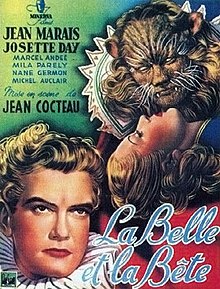
Fig. 1
Much different from the more modern films, "Cocteau uses haunting images and bold Freudian symbols to suggest that emotions are at a boil in the subconscious of his characters." (Ebert, 1999). You can see just how much thought has been put into the set design, from the extravagant costumes to the elegant castle at The Beast resides in. Symbolism is used throughout the film to covey the thoughts of the characters, like spilled pearls or knives which are more than just an object: they have completely different meanings, and certainly shouldn't be taken at face value.

Fig. 2
Despite the erotic connotations throughout the film, there is still the strong sense of fantasy and magic, something which is later replicated in the Disney film. Described as being full of "wonder and mystery" (Brooks, 2014), La Belle et La Bete transports the audience to another world, with magical objects, a huge and beautiful castle, and a heart-warming love story. This is something that the audience of 1946 would have wanted, after all, France has just been ravaged by the Nazis in WW2. This child-like theme continues throughout the film, not only through the beautiful cinematic shots, but the use of sound and music. Although the movie doesn't have a stereotypically 'happy' ending, it still leaves the viewer satisfied at the end of the story. Even though we don't know what will happen to Belle's family, or even Belle herself, there's something about Belle and The Beast just floating away before the end credits that leaves the audience feeling like the story is complete.

Fig, 3
The film is bold and simple, and Cocteau uses his skills to work on "weaving a priceless fabric of subtle images." (Crowther, 1947). La Belle et La Bete, despite its underlying sexual messages, is, at heart, a film about a woman falling in love with an unlikely suitor, full of fantastical props, a beautiful castle, and a story that transports the audience to another world.


Bibliography
Brooks, X (2014). "La Belle et la BĂȘte – review" In The Guardian [online]. Available at: https://www.theguardian.com/film/2014/jan/05/la-belle-et-la-bete-remastered-cocteau-review
Crowther, B (1947). "THE SCREEN IN REVIEW" In The New York Times [online]. Available at: http://www.nytimes.com/movie/review?res=9B03EFD71E3EEE3BBC4C51DFB467838C659EDE
Ebert, R (1999). "Beauty and the Beast" In Roger Ebert [online]. Available at: https://www.rogerebert.com/reviews/great-movie-beauty-and-the-beast-1946


Illustration List
Fig. 1 - https://upload.wikimedia.org/wikipedia/en/thumb/a/a4/La_Belle_et_la_B%C3%AAte_film.jpg/220px-La_Belle_et_la_B%C3%AAte_film.jpg
Fig. 2 - https://brendancultfilms.files.wordpress.com/2011/12/screen-shot-2011-12-06-at-8-54-46-am.png
Fig. 3 - https://i.ytimg.com/vi/36MbmkriK2g/hqdefault.jpg

Friday 1 December 2017

The 'What If?' Metropolis - Finished Concept

I've finished my concept art (finally!). I'm a little disappointed because I don't think I like it. I'm having a lot of trouble deciding on colours and I just don't think they look quite right. Or maybe I've just been staring at it for too long? Any advice is welcome! Here's the process, from where I left off on my last post to the finish.

Continuing the shading!

More shading, finishing off the right hand side of the painting.

Starting shading on the left side of the painting.

Finished all shading and final details!

Adding colour


Final piece