Friday, 10 November 2017

Toolkit - Concept Art and Colour Theory

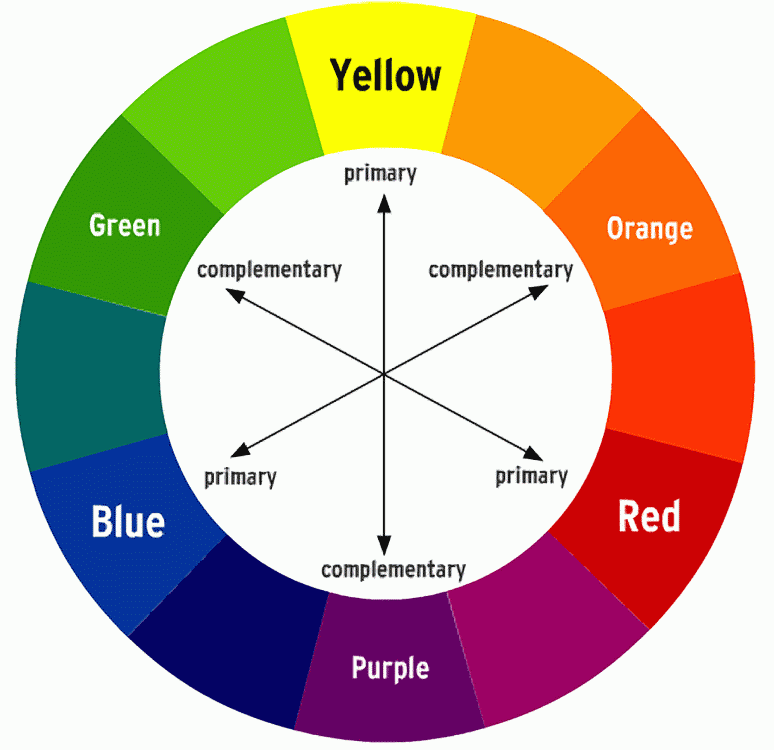
In Jordan's Photoshop class, we worked on some concept art for our cities. I drew out a few different designs which I have published in my last Invisible Cities post. As well as this, we went over colour theory, which was very interesting. I wanted to make a note on here of what we learnt about colour so I'll always have something to refer back to.

We learnt about the basic colour wheel, and we went over hues, tints, tones and shades. What interested me the most was how to pick your colours using different methods. You can pick your colours based on whether they are complementary or not. By doing this, you'll be able to make your art pieces pop a bit more: for example, if you have a red environment and use blue shadows, it'll look a lot more vibrant and interesting, compared to just using a darker red for the shadow (which is what I usually do!)

Toolkit - Timing in Animation

In Nat's lesson last week we worked on timing. I wasn't in this lesson, but I managed to gather enough information to understand what I needed to do! In the GIF below are the examples I've made that I'm pretty sure was covered in Nat's class.


The top ball is travelling at a constant speed from one side of the screen to the other, whereas the one below it eases in, speeds up, and then slows down to ease back out again. To ease it in, you need to include more frames at the beginning, then do less to make it speed up. The class then applied this logic to a pendulum swinging back and forth.


In this pendulum example, you can see that the ball is swinging at a constant speed, and it doesn't really look that natural at all. However, if you apply the 'ease in, ease out' principle to it, and add in an arc to give it a more natural swing, the whole animation suddenly looks a lot smoother:


It was interesting to apply this logic to different scenarios, and I can think of lots of different ways in how it can be helpful in animation, such as a car speeding up and slowing down, a ball, or other objects. Hopefully I've accurately covered all I missed in that lesson, this is as much as I could gather from talking to Nat, my classmates and also looking at their blogs!

Toolkit - Perspective, Composition, Rule of Thirds

In one of Jordan's earlier classes we worked on perspective and composition. I wasn't well for the class but I've caught up looking at other people's blogs and looking at the material from the lesson! This blog is about a month late but I'm finally trying to prioritise getting my backlog of work all uploaded and finished, so expect a lot of previous stuff in the next few days!

At first I worked on perspective. I've already done the perspective exercises traditionally, but I've also completed some digital ones too. Here's what I've done to practice:


I've also researched on making a good composition which involves the rule of thirds. The teaching is that by drawing a 3x3 grid on your page you can use the lines as a guide to create a 'good' composition. The horizon is meant to sit on the lower horizontal line, and points of interest are meant to fall on any of the lines (or at least close to where the lines are, or where they intersect). I've included a photograph as an example below.


Monday, 6 November 2017

Toolkit - Maya Alley Texturing

Today in Simon's class we worked on the previous alley model we had made and began to set it up for texturing. I didn't have my finished file with me for the lesson so I used an unfinished one which is why it looks a little scruffy!


We learnt how to properly apply materials onto surfaces, and how to use the UV editor to edit the texture so it isn't stretched or warped. By doing this, when it comes to putting the final texture on, it'll be a lot easier as we've already smoothed out all the problems. We will move on to actual texturing next week!

Wednesday, 1 November 2017

The 'What If?' Metropolis - Digital Thumbnails 39-76

Here's all of the thumbnails I've done so far! Will definitely be more to come soon, I'm loving all of the ideas I have so far and can't wait to keep developing them.


The 'What If?' Metropolis - Online Greenlight Review

Here is my OGR! I'm so pleased I managed to reach the required amount of thumbnails. It's crazy that I've managed to do 76 in just a week! I couldn't even reach 100 over the five weeks of Invisible Cities so it's such a big improvement. I didn't quite reach 1000 words on my travelogue, and I think it does need a bit more polishing. At least it gives a basic idea of what I want the city to be like. I've named the city Alptraum, which is German for 'nightmare', and I quite like the name, although I'm going to keep looking for better ones so it may change later!

Monday, 30 October 2017

The 'What If?' Metropolis - Updated Influence Map

I've been working on a small influence map to show the images that have been helping me out the most when making my thumbnails: I'm sure if you compare these pictures to my drawings you can see where a lot of them have come from! There's not really much in this presentation but I really wanted to compile some of Haeckel's art that I've found the most inspiring so far. Of course, I'm still using my previous inspiration maps throughout my thumbnails, but I'm now also using this one to give me a bit of an extra boost!